Cordova app not displaying correctly on iPhone X (Simulator)
I found the solution to the white bars here:
Set viewport-fit=cover on the viewport <meta> tag, i.e.:
<meta name="viewport" content="initial-scale=1, width=device-width, height=device-height, viewport-fit=cover">The white bars in UIWebView then disappear:

The solution to remove the black areas (provided by @dpogue in a comment below) is to use LaunchStoryboard images with cordova-plugin-splashscreen to replace the legacy launch images, used by Cordova by default. To do so, add the following to the iOS platform in config.xml:
<platform name="ios"> <splash src="res/screen/ios/Default@2x~iphone~anyany.png" /> <splash src="res/screen/ios/Default@2x~iphone~comany.png" /> <splash src="res/screen/ios/Default@2x~iphone~comcom.png" /> <splash src="res/screen/ios/Default@3x~iphone~anyany.png" /> <splash src="res/screen/ios/Default@3x~iphone~anycom.png" /> <splash src="res/screen/ios/Default@3x~iphone~comany.png" /> <splash src="res/screen/ios/Default@2x~ipad~anyany.png" /> <splash src="res/screen/ios/Default@2x~ipad~comany.png" /> <!-- more iOS config... --></platform>Then create the images with the following dimensions in res/screen/ios (remove any existing ones):
Default@2x~iphone~anyany.png - 1334x1334Default@2x~iphone~comany.png - 750x1334Default@2x~iphone~comcom.png - 1334x750Default@3x~iphone~anyany.png - 2208x2208Default@3x~iphone~anycom.png - 2208x1242Default@3x~iphone~comany.png - 1242x2208Default@2x~ipad~anyany.png - 2732x2732Default@2x~ipad~comany.png - 1278x2732Once the black bars are removed, there's another thing that's different about the iPhone X to address: The status bar is larger than 20px due to the "notch", which means any content at the far top of your Cordova app will be obscured by it:
Rather than hard-coding a padding in pixels, you can handle this automatically in CSS using the new safe-area-inset-* constants in iOS 11.
Note: in iOS 11.0 the function to handle these constants was called constant() but in iOS 11.2 Apple renamed it to env() (see here), therefore to cover both cases you need to overload the CSS rule with both and rely on the CSS fallback mechanism to apply the appropriate one:
body{ padding-top: constant(safe-area-inset-top); padding-top: env(safe-area-inset-top);}The result is then as desired: the app content covers the full screen, but is not obscured by the "notch":

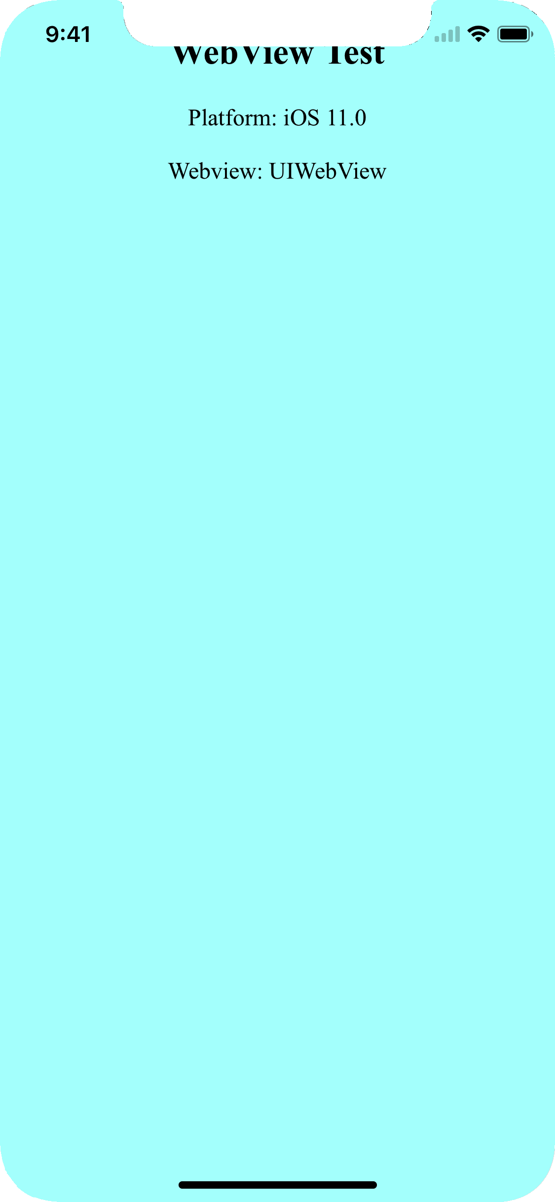
I've created a Cordova test project which illustrates the above steps: webview-test.zip
Notes:
Footer buttons
- If your app has footer buttons (as mine does), you will also need to apply
safe-area-inset-bottomto avoid them being overlapped by the virtual Home button on iPhone X. - In my case, I couldn't apply this to
<body>as the footer is absolutely positioned, so I needed to apply it directly to the footer:
.toolbar-footer{ margin-bottom: constant(safe-area-inset-bottom); margin-bottom: env(safe-area-inset-bottom);}cordova-plugin-statusbar
- The status bar size has changed on iPhone X, so older versions of
cordova-plugin-statusbardisplay incorrectly on iPhone X - Mike Hartington has created this pull request which applies the necessary changes.
- This was merged into the
cordova-plugin-statusbar@2.3.0release, so make sure you're using at least this version to apply to safe-area-insets
splashscreen
- The LaunchScreen storyboard constraints changed on iOS 11/iPhone X, meaning the splashscreen appeared to "jump" on launch when using existing versions of the plugin (see here).
- This was captured in bug report CB-13505, fixed PR cordova-ios#354 and released in
cordova-ios@4.5.4, so make sure you're using a recent version of thecordova-iosplatform.
device orientation
- When using UIWebView on iOS 11.0, rotating from portrait > landscape > portrait causes the
safe-area-insetnot to be re-applied, causing the content to be obscured by the notch again (as highlighted by jms in a comment below). - Also happens if app is launched in landscape then rotated to portrait
- This doesn't happen when using WKWebView via
cordova-plugin-wkwebview-engine. - Radar report: http://www.openradar.me/radar?id=5035192880201728
- Update: this appears to have been fixed in iOS 11.1
For reference, this is the original Cordova issue I opened which captures this: https://issues.apache.org/jira/browse/CB-13273
For a manual fix to an existing cordova project
The black bars
Add this to your info.plist file. Fixing the launch image is a separate issue i.e. How to Add iPhoneX Launch Image
<key>UILaunchStoryboardName</key><string>CDVLaunchScreen</string>The white bars
Set viewport-fit=cover in the meta tag
<meta name="viewport" content="initial-scale=1, width=device-width, height=device-height, viewport-fit=cover">
There is 3 steps you have to do
for iOs 11 status bar & iPhone X header problems
1. Viewport fit cover
Add viewport-fit=cover to your viewport's meta in <header>
<meta name="viewport" content="width=device-width,initial-scale=1,maximum-scale=1,user-scalable=0,viewport-fit=cover">Demo: https://jsfiddle.net/gq5pt509 (index.html)
- Add more splash images to your
config.xmlinside<platform name="ios">
Dont skip this step, this required for getting screen fit for iPhone X work
<splash src="your_path/Default@2x~ipad~anyany.png" /> <!-- 2732x2732 --><splash src="your_path/Default@2x~ipad~comany.png" /> <!-- 1278x2732 --><splash src="your_path/Default@2x~iphone~anyany.png" /> <!-- 1334x1334 --><splash src="your_path/Default@2x~iphone~comany.png" /> <!-- 750x1334 --><splash src="your_path/Default@2x~iphone~comcom.png" /> <!-- 1334x750 --><splash src="your_path/Default@3x~iphone~anyany.png" /> <!-- 2208x2208 --><splash src="your_path/Default@3x~iphone~anycom.png" /> <!-- 2208x1242 --><splash src="your_path/Default@3x~iphone~comany.png" /> <!-- 1242x2208 -->Demo: https://jsfiddle.net/mmy885q4 (config.xml)
- Fix your style on CSS
Use safe-area-inset-left, safe-area-inset-right, safe-area-inset-top, or safe-area-inset-bottom
Example: (Use in your case!)
#header { position: fixed; top: 1.25rem; // iOs 10 or lower top: constant(safe-area-inset-top); // iOs 11 top: env(safe-area-inset-top); // iOs 11+ (feature) // or use calc() top: calc(constant(safe-area-inset-top) + 1rem); top: env(constant(safe-area-inset-top) + 1rem); // or SCSS calc() $nav-height: 1.25rem; top: calc(constant(safe-area-inset-top) + #{$nav-height}); top: calc(env(safe-area-inset-top) + #{$nav-height});}Bonus: You can add body class like is-android or is-ios on deviceready
var platformId = window.cordova.platformId;if (platformId) { document.body.classList.add('is-' + platformId);}So you can do something like this on CSS
.is-ios #header { // Properties}