Android - border for button
Step 1 : Create file named : my_button_bg.xml
Step 2 : Place this file in res/drawables.xml
Step 3 : Insert below code
<?xml version="1.0" encoding="utf-8"?><shape xmlns:android="http://schemas.android.com/apk/res/android" android:shape="rectangle"> <gradient android:startColor="#FFFFFF" android:endColor="#00FF00" android:angle="270" /> <corners android:radius="3dp" /> <stroke android:width="5px" android:color="#000000" /></shape>Step 4: Use code "android:background="@drawable/my_button_bg" where needed eg below:
<Button android:layout_width="wrap_content" android:layout_height="wrap_content" android:text="Your Text" android:background="@drawable/my_button_bg" />
• Android Official Solution
Since Android Design Support v28 was introduced, it's easy to create a bordered button using MaterialButton. This class supplies updated Material styles for the button in the constructor. Using app:strokeColor and app:strokeWidth you can create a custom border as following:
1. When you use androidx:
build.gradle
dependencies { implementation 'androidx.appcompat:appcompat:1.1.0' implementation 'com.google.android.material:material:1.0.0'}• Bordered Button:
<com.google.android.material.button.MaterialButton style="@style/Widget.AppCompat.Button.Colored" android:layout_width="wrap_content" android:layout_height="wrap_content" android:text="MATERIAL BUTTON" android:textSize="15sp" app:strokeColor="@color/green" app:strokeWidth="2dp" />• Unfilled Bordered Button:
<com.google.android.material.button.MaterialButton style="@style/Widget.AppCompat.Button.Borderless" android:layout_width="wrap_content" android:layout_height="wrap_content" android:text="UNFILLED MATERIAL BUTTON" android:textColor="@color/green" android:textSize="15sp" app:backgroundTint="@android:color/transparent" app:cornerRadius="8dp" app:rippleColor="#33AAAAAA" app:strokeColor="@color/green" app:strokeWidth="2dp" />2. When you use appcompat:
build.gradle
dependencies { implementation 'com.android.support:design:28.0.0'}style.xml
Ensure your application theme inherits from Theme.MaterialComponents instead of Theme.AppCompat.
<style name="AppTheme" parent="Theme.MaterialComponents.Light.DarkActionBar"> <!-- Customize your theme here. --></style>• Bordered Button:
<android.support.design.button.MaterialButton android:layout_width="wrap_content" android:layout_height="wrap_content" android:text="MATERIAL BUTTON" android:textSize="15sp" app:strokeColor="@color/green" app:strokeWidth="2dp" />• Unfilled Bordered Button:
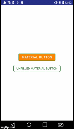
<android.support.design.button.MaterialButton style="@style/Widget.AppCompat.Button.Borderless" android:layout_width="wrap_content" android:layout_height="wrap_content" android:text="UNFILLED MATERIAL BUTTON" android:textColor="@color/green" android:textSize="15sp" app:backgroundTint="@android:color/transparent" app:cornerRadius="8dp" app:rippleColor="#33AAAAAA" app:strokeColor="@color/green" app:strokeWidth="2dp" />Visual Result
Create a button_border.xml file in your drawable folder.
res/drawable/button_border.xml
<?xml version="1.0" encoding="utf-8"?><shape xmlns:android="http://schemas.android.com/apk/res/android" android:shape="rectangle" > <solid android:color="#FFDA8200" /> <stroke android:width="3dp" android:color="#FFFF4917" /></shape>And add button to your XML activity layout and set background android:background="@drawable/button_border".
<Button android:layout_width="wrap_content" android:layout_height="wrap_content" android:background="@drawable/button_border" android:text="Button Border" />