Android - How to change default SeekBar thickness?
You have to change progressDrawable and thumb of SeekBar to adjust it's thickness :
<SeekBar android:id="@+id/seekBar" android:layout_width="match_parent" android:layout_height="wrap_content" android:layout_below="@id/indSeekBar" android:layout_marginTop="48dp" android:progressDrawable="@drawable/seek_bar" android:thumb="@drawable/seek_thumb" />Add in drawable folder seek_bar.xml :
<layer-list xmlns:android="http://schemas.android.com/apk/res/android"> <item android:id="@android:id/background"> <shape android:shape="line"> <stroke android:color="@color/seek_bar_background" android:width="@dimen/seek_bar_thickness"/> </shape> </item> <item android:id="@android:id/secondaryProgress"> <clip> <shape android:shape="line"> <stroke android:color="@color/seek_bar_secondary_progress" android:width="@dimen/seek_bar_thickness"/> </shape> </clip> </item> <item android:id="@android:id/progress"> <clip> <shape android:shape="line"> <stroke android:color="@color/seek_bar_progress" android:width="@dimen/seek_bar_thickness"/> </shape> </clip> </item></layer-list>seek_thumb.xml :
<shape xmlns:android="http://schemas.android.com/apk/res/android" android:shape="oval"> <size android:height="@dimen/seek_bar_thumb_size" android:width="@dimen/seek_bar_thumb_size" /> <solid android:color="@color/seek_bar_progress"/></shape>Add to dimension resources (change this to adjust thickness) :
<dimen name="seek_bar_thickness">4dp</dimen><dimen name="seek_bar_thumb_size">20dp</dimen>Add color resources :
<color name="seek_bar_background">#ababab</color><color name="seek_bar_progress">#ffb600</color><color name="seek_bar_secondary_progress">#3399CC</color>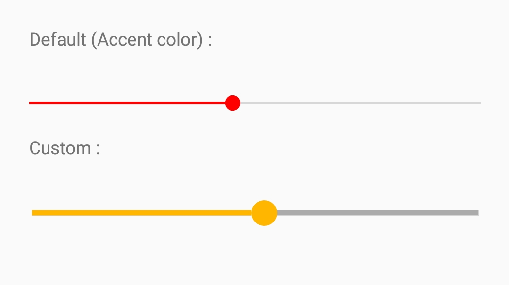
You should do like this:
<SeekBar android:layout_width="match_parent" android:layout_height="wrap_content" android:layout_marginTop="20dp" android:thumb="@drawable/seek" android:progressDrawable="@drawable/seek_style" />The thumb is the circle which can be dragged, and the progressDrasable is the style of progress.
seek_style.xml:
<layer-list xmlns:android="http://schemas.android.com/apk/res/android"> <item android:id="@android:id/background"> <shape> <corners android:radius="5dip" /> <gradient android:startColor="#ff9d9e9d" android:centerColor="#ff5a5d5a" android:centerY="0.75" android:endColor="#ff747674" android:angle="270" /> </shape> </item> <item android:id="@android:id/secondaryProgress"> <clip> <shape> <corners android:radius="5dip" /> <gradient android:startColor="#80ffd300" android:centerColor="#80ffb600" android:centerY="0.75" android:endColor="#a0ffcb00" android:angle="270" /> </shape> </clip> </item> <item android:id="@android:id/progress"> <clip> <shape> <corners android:radius="5dip" /> <gradient android:startColor="#ff0099CC" android:centerColor="#ff3399CC" android:centerY="0.75" android:endColor="#ff6699CC" android:angle="270" /> </shape> </clip> </item></layer-list>seek.xml:
<shape xmlns:android="http://schemas.android.com/apk/res/android" android:shape="oval"> <size android:width="20dp" android:height="20dp" /> <solid android:color="#60f0"/></shape>
You can use the Slider provided by the Material Components Library.
Use the app:trackHeight="xxdp" (the default value is 4dp) to change the height of the track bar.
<com.google.android.material.slider.Slider app:trackHeight="12dp" .../>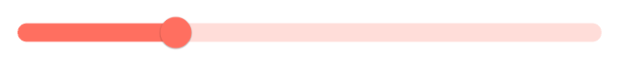
If you want to change also the thumb radius you can use the app:thumbRadius attribute:
<com.google.android.material.slider.Slider app:trackHeight="12dp" app:thumbRadius="16dp" ../> 
It requires the version 1.2.0 of the library.