CardView Corner Radius
Unless you try to extend the Android CardView class, you cannot customize that attribute from XML.
Nonetheless, there is a way of obtaining that effect.
Place a CardView inside another CardView and apply a transparent background to your outer CardView and remove its corner radius ("cornerRadios = 0dp"). Your inner CardView will have a cornerRadius value of 3dp, for example. Then apply a marginTop to your inner CardView, so its bottom bounds will be cut by the outer CardView. This way, the bottom corner radius of your inner CardView will be hidden.
The XML code is the following:
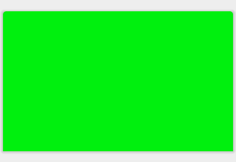
<android.support.v7.widget.CardView xmlns:card_view="http://schemas.android.com/apk/res-auto" android:id="@+id/card_view_outer" android:layout_width="match_parent" android:layout_height="200dp" android:layout_gravity="center" card_view:cardBackgroundColor="@android:color/transparent" card_view:cardCornerRadius="0dp" card_view:cardElevation="3dp" > <android.support.v7.widget.CardView xmlns:card_view="http://schemas.android.com/apk/res-auto" android:id="@+id/card_view_inner" android:layout_width="match_parent" android:layout_height="200dp" android:layout_gravity="center" android:layout_marginTop="3dp" card_view:cardBackgroundColor="@color/green" card_view:cardCornerRadius="4dp" card_view:cardElevation="0dp" > </android.support.v7.widget.CardView></android.support.v7.widget.CardView>And the visual effect is the following:
Always put your content in your Inner CardView. Your outer CardView serves only the purpose of "hiding" the bottom Rounded Corners of the inner CardView.
You can use the standard MaterialCard included in the official Material Components library.
Use in your layout:
<com.google.android.material.card.MaterialCardView style="@style/MyCardView" ...>In your style use the shapeAppearanceOverlay attribute to customize the shape (the default corner radius is 4dp)
<style name="MyCardView" parent="@style/Widget.MaterialComponents.CardView"> <item name="shapeAppearanceOverlay">@style/ShapeAppearanceOverlay.MaterialCardView.Cut</item> </style> <style name="ShapeAppearanceOverlay.MaterialCardView.Cut" parent=""> <item name="cornerFamily">rounded</item> <item name="cornerSizeTopRight">8dp</item> <item name="cornerSizeTopLeft">8dp</item> <item name="cornerSizeBottomRight">0dp</item> <item name="cornerSizeBottomLeft">0dp</item> </style>You can also use:
<com.google.android.material.card.MaterialCardView app:shapeAppearanceOverlay="@style/ShapeAppearanceOverlay.MaterialCardView.Cut" ...>It is the result:

dependencies: compile 'com.android.support:cardview-v7:23.1.1'<android.support.v7.widget.CardView android:layout_width="80dp" android:layout_height="80dp" android:elevation="12dp" android:id="@+id/view2" app:cardCornerRadius="40dp" android:layout_centerHorizontal="true" android:innerRadius="0dp" android:shape="ring" android:thicknessRatio="1.9"> <ImageView android:layout_height="80dp" android:layout_width="match_parent" android:id="@+id/imageView1" android:src="@drawable/Your_image" android:layout_alignParentTop="true" android:layout_centerHorizontal="true"> </ImageView></android.support.v7.widget.CardView>