Coloring Buttons in Android with Material Design and AppCompat
Officially fixed in Support Library rev.22 (Fri March 13, 2015). See relevant google code issue:
https://issuetracker.google.com/issues/37008632
Usage example
theme.xml:
<item name="colorButtonNormal">@color/button_color</item>v21/theme.xml
<item name="android:colorButtonNormal">@color/button_color</item>
Edit (22.06.2016):
Appcompat library started to support material buttons after I posted the original response. In this post you can see the easiest implementation of raised and flat buttons.
Original Answer:
Since that AppCompat doesn't support the button yet you can use xml as backgrounds. For doing that I had a look at the source code of the Android and found the related files for styling material buttons.
1 - Look at the original implementation of material button from source.
Have a look at the btn_default_material.xml on android source code.
You can copy the file into your projects drawable-v21 folder. But don't touch the color attr here. The file you need to change is the second file.
drawable-v21/custom_btn.xml
<ripple xmlns:android="http://schemas.android.com/apk/res/android" android:color="?attr/colorControlHighlight"> <item android:drawable="@drawable/btn_default_mtrl_shape" /></ripple>2 - Get the shape of the original material button
As you realise there is a shape used inside this drawable which you can find in this file of the source code.
<inset xmlns:android="http://schemas.android.com/apk/res/android" android:insetLeft="@dimen/button_inset_horizontal_material" android:insetTop="@dimen/button_inset_vertical_material" android:insetRight="@dimen/button_inset_horizontal_material" android:insetBottom="@dimen/button_inset_vertical_material"><shape android:shape="rectangle"> <corners android:radius="@dimen/control_corner_material" /> <solid android:color="?attr/colorButtonNormal" /> <padding android:left="@dimen/button_padding_horizontal_material" android:top="@dimen/button_padding_vertical_material" android:right="@dimen/button_padding_horizontal_material" android:bottom="@dimen/button_padding_vertical_material" /></shape>3 - Getting dimensions of the material button
And in this file you there are some dimensions used from the file that you can find here. You can copy the whole file and put into your values folder. This is important for applying the same size (that is used in material buttons) to all buttons
4 - Create another drawable file for old versions
For older versions you should have another drawable with the same name. I am directly putting the items inline instead of referencing. You may want to reference them. But again, the most important thing is the original dimensions of the material button.
drawable/custom_btn.xml
<?xml version="1.0" encoding="utf-8"?> <selector xmlns:android="http://schemas.android.com/apk/res/android"> <!-- pressed state --> <item android:state_pressed="true"> <inset xmlns:android="http://schemas.android.com/apk/res/android" android:insetLeft="@dimen/button_inset_horizontal_material" android:insetTop="@dimen/button_inset_vertical_material" android:insetRight="@dimen/button_inset_horizontal_material" android:insetBottom="@dimen/button_inset_vertical_material"> <shape android:shape="rectangle"> <corners android:radius="@dimen/control_corner_material" /> <solid android:color="@color/PRESSED_STATE_COLOR" /> <padding android:left="@dimen/button_padding_horizontal_material" android:top="@dimen/button_padding_vertical_material" android:right="@dimen/button_padding_horizontal_material" android:bottom="@dimen/button_padding_vertical_material" /> </shape> </inset> </item> <!-- focused state --> <item android:state_focused="true"> <inset xmlns:android="http://schemas.android.com/apk/res/android" android:insetLeft="@dimen/button_inset_horizontal_material" android:insetTop="@dimen/button_inset_vertical_material" android:insetRight="@dimen/button_inset_horizontal_material" android:insetBottom="@dimen/button_inset_vertical_material"> <shape android:shape="rectangle"> <corners android:radius="@dimen/control_corner_material" /> <solid android:color="@color/FOCUSED_STATE_COLOR" /> <padding android:left="@dimen/button_padding_horizontal_material" android:top="@dimen/button_padding_vertical_material" android:right="@dimen/button_padding_horizontal_material" android:bottom="@dimen/button_padding_vertical_material" /> </shape> </inset> </item> <!-- normal state --> <item> <inset xmlns:android="http://schemas.android.com/apk/res/android" android:insetLeft="@dimen/button_inset_horizontal_material" android:insetTop="@dimen/button_inset_vertical_material" android:insetRight="@dimen/button_inset_horizontal_material" android:insetBottom="@dimen/button_inset_vertical_material"> <shape android:shape="rectangle"> <corners android:radius="@dimen/control_corner_material" /> <solid android:color="@color/NORMAL_STATE_COLOR" /> <padding android:left="@dimen/button_padding_horizontal_material" android:top="@dimen/button_padding_vertical_material" android:right="@dimen/button_padding_horizontal_material" android:bottom="@dimen/button_padding_vertical_material" /> </shape> </inset> </item></selector>Result
Your button will have ripple effect on Lollipop devices. The old versions will have exactly same button except the ripple effect. But since that you provide drawables for different states, they'll also respond to touch events (as the old way).
This has been enhanced in v23.0.0 of AppCompat librarywith the addition of more themes including
Widget.AppCompat.Button.Colored
First of all include appCompat dependency if you haven't already
compile('com.android.support:appcompat-v7:23.0.0') { exclude group: 'com.google.android', module: 'support-v4'}now since you need to use v23 of the app compat, you'll need to target SDK-v23 as well!
compileSdkVersion = 23 targetSdkVersion = 23In your values/theme
<item name="android:buttonStyle">@style/BrandButtonStyle</item>In your values/style
<style name="BrandButtonStyle" parent="Widget.AppCompat.Button.Colored"> <item name="colorButtonNormal">@color/yourButtonColor</item> <item name="android:textColor">@color/White</item></style>In your values-v21/style
<style name="BrandButtonStyle" parent="Widget.AppCompat.Button.Colored"> <item name="android:colorButtonNormal">@color/yourButtonColor</item> <item name="android:textColor">@color/White</item></style>Since your button theme is based on Widget.AppCompat.Button.Colored The text color on the button is by default white!
but it seems there is an issue when you disable the button, the button will change its color to light grey, but the text color will remain white!
a workaround for this is to specifically set the text color on the button to white!as I have done in the style shown above.
now you can simply define your button and let AppCompat do the rest :)
<Button android:layout_width="200dp" android:layout_height="48dp" />Disabled State
Enabled State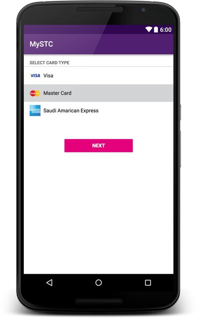
Edit:
To add <Button android:theme="@style/BrandButtonStyle"/>