How do I use DrawerLayout to display over the ActionBar/Toolbar and under the status bar?
New functionality in the framework and support libs allow exactly this. There are three 'pieces of the puzzle':
- Using Toolbar so that you can embed your action bar into your view hierarchy.
- Making DrawerLayout
fitsSystemWindowsso that it is layed out behind the system bars. - Disabling
Theme.Material's normal status bar coloring so that DrawerLayout can draw there instead.
I'll assume that you will use the new appcompat.
First, your layout should look like this:
<!-- The important thing to note here is the added fitSystemWindows --><android.support.v4.widget.DrawerLayout xmlns:android="http://schemas.android.com/apk/res/android" android:id="@+id/my_drawer_layout" android:layout_width="match_parent" android:layout_height="match_parent" android:fitsSystemWindows="true"> <!-- Your normal content view --> <LinearLayout android:layout_width="match_parent" android:layout_height="match_parent" android:orientation="vertical"> <!-- We use a Toolbar so that our drawer can be displayed in front of the action bar --> <android.support.v7.widget.Toolbar android:id="@+id/my_awesome_toolbar" android:layout_height="wrap_content" android:layout_width="match_parent" android:minHeight="?attr/actionBarSize" android:background="?attr/colorPrimary" /> <!-- The rest of your content view --> </LinearLayout> <!-- Your drawer view. This can be any view, LinearLayout is just an example. As we have set fitSystemWindows=true this will be displayed under the status bar. --> <LinearLayout android:layout_width="304dp" android:layout_height="match_parent" android:layout_gravity="left|start" android:fitsSystemWindows="true"> <!-- Your drawer content --> </LinearLayout></android.support.v4.widget.DrawerLayout>Then in your Activity/Fragment:
public void onCreate(Bundled savedInstanceState) { super.onCreate(savedInstanceState); // Your normal setup. Blah blah ... // As we're using a Toolbar, we should retrieve it and set it // to be our ActionBar Toolbar toolbar = (...) findViewById(R.id.my_awesome_toolbar); setSupportActionBar(toolbar); // Now retrieve the DrawerLayout so that we can set the status bar color. // This only takes effect on Lollipop, or when using translucentStatusBar // on KitKat. DrawerLayout drawerLayout = (...) findViewById(R.id.my_drawer_layout); drawerLayout.setStatusBarBackgroundColor(yourChosenColor);}Then you need to make sure that the DrawerLayout is visible behind the status bar. You do that by changing your values-v21 theme:
values-v21/themes.xml
<style name="Theme.MyApp" parent="Theme.AppCompat.Light.NoActionBar"> <item name="android:windowDrawsSystemBarBackgrounds">true</item> <item name="android:statusBarColor">@android:color/transparent</item> <item name="android:windowTranslucentStatus">true</item></style>Note:If a <fragment android:name="fragments.NavigationDrawerFragment"> is used instead of
<LinearLayout android:layout_width="304dp" android:layout_height="match_parent" android:layout_gravity="left|start" android:fitsSystemWindows="true"> <!-- Your drawer content --></LinearLayout>the actual layout, the desired effect will be achieved if you call fitsSystemWindows(boolean) on a view that you return from onCreateView method.
@Overridepublic View onCreateView(LayoutInflater inflater, ViewGroup container, Bundle savedInstanceState) { View mDrawerListView = inflater.inflate( R.layout.fragment_navigation_drawer, container, false); mDrawerListView.setFitsSystemWindows(true); return mDrawerListView;}
EDIT: The new Design Support Library supports this and the previous method is no longer required.
This can now be achieved using the new Android Design Support Library.
You can see the Cheesesquare sample app by Chris Banes which demos all the new features.
Previous method:
Since there is no complete solution posted, here is the way I achieved the desired result.
First include a ScrimInsetsFrameLayout in your project.
/** Copyright 2014 Google Inc.** Licensed under the Apache License, Version 2.0 (the "License");* you may not use this file except in compliance with the License.* You may obtain a copy of the License at** http://www.apache.org/licenses/LICENSE-2.0** Unless required by applicable law or agreed to in writing, software* distributed under the License is distributed on an "AS IS" BASIS,* WITHOUT WARRANTIES OR CONDITIONS OF ANY KIND, either express or implied.* See the License for the specific language governing permissions and* limitations under the License.*//*** A layout that draws something in the insets passed to * {@link #fitSystemWindows(Rect)}, i.e. the area above UI chrome* (status and navigation bars, overlay action bars).*/public class ScrimInsetsFrameLayout extends FrameLayout { private Drawable mInsetForeground; private Rect mInsets; private Rect mTempRect = new Rect(); private OnInsetsCallback mOnInsetsCallback; public ScrimInsetsFrameLayout(Context context) { super(context); init(context, null, 0); } public ScrimInsetsFrameLayout(Context context, AttributeSet attrs) { super(context, attrs); init(context, attrs, 0); } public ScrimInsetsFrameLayout( Context context, AttributeSet attrs, int defStyle) { super(context, attrs, defStyle); init(context, attrs, defStyle); } private void init(Context context, AttributeSet attrs, int defStyle) { final TypedArray a = context.obtainStyledAttributes(attrs, R.styleable.ScrimInsetsView, defStyle, 0); if (a == null) { return; } mInsetForeground = a.getDrawable( R.styleable.ScrimInsetsView_insetForeground); a.recycle(); setWillNotDraw(true); } @Override protected boolean fitSystemWindows(Rect insets) { mInsets = new Rect(insets); setWillNotDraw(mInsetForeground == null); ViewCompat.postInvalidateOnAnimation(this); if (mOnInsetsCallback != null) { mOnInsetsCallback.onInsetsChanged(insets); } return true; // consume insets } @Override public void draw(Canvas canvas) { super.draw(canvas); int width = getWidth(); int height = getHeight(); if (mInsets != null && mInsetForeground != null) { int sc = canvas.save(); canvas.translate(getScrollX(), getScrollY()); // Top mTempRect.set(0, 0, width, mInsets.top); mInsetForeground.setBounds(mTempRect); mInsetForeground.draw(canvas); // Bottom mTempRect.set(0, height - mInsets.bottom, width, height); mInsetForeground.setBounds(mTempRect); mInsetForeground.draw(canvas); // Left mTempRect.set( 0, mInsets.top, mInsets.left, height - mInsets.bottom); mInsetForeground.setBounds(mTempRect); mInsetForeground.draw(canvas); // Right mTempRect.set( width - mInsets.right, mInsets.top, width, height - mInsets.bottom); mInsetForeground.setBounds(mTempRect); mInsetForeground.draw(canvas); canvas.restoreToCount(sc); } } @Override protected void onAttachedToWindow() { super.onAttachedToWindow(); if (mInsetForeground != null) { mInsetForeground.setCallback(this); } } @Override protected void onDetachedFromWindow() { super.onDetachedFromWindow(); if (mInsetForeground != null) { mInsetForeground.setCallback(null); } } /** * Allows the calling container to specify a callback for custom * processing when insets change (i.e. when {@link #fitSystemWindows(Rect)} * is called. This is useful for setting padding on UI elements * based on UI chrome insets (e.g. a Google Map or a ListView). * When using with ListView or GridView, remember to set * clipToPadding to false. */ public void setOnInsetsCallback(OnInsetsCallback onInsetsCallback) { mOnInsetsCallback = onInsetsCallback; } public static interface OnInsetsCallback { public void onInsetsChanged(Rect insets); }}Then create a styleable so that the insetForeground can be set.
values/attrs.xml
<declare-styleable name="ScrimInsetsView"> <attr name="insetForeground" format="reference|color" /></declare-styleable>Update your activity's xml file and make sure android:fitsSystemWindows is set to true on both the DrawerLayout as well as the ScrimInsetsFrameLayout.
layout/activity_main.xml
<android.support.v4.widget.DrawerLayout xmlns:android="http://schemas.android.com/apk/res/android" xmlns:tools="http://schemas.android.com/tools" android:id="@+id/drawerLayout" android:layout_width="match_parent" android:layout_height="match_parent" android:fitsSystemWindows="true" tools:context=".MainActivity"> <!-- The main content view --> <LinearLayout android:layout_width="match_parent" android:layout_height="match_parent" android:orientation="vertical"> <!-- Your main content --> </LinearLayout> <!-- The navigation drawer --> <com.example.app.util.ScrimInsetsFrameLayout xmlns:app="http://schemas.android.com/apk/res-auto" android:id="@+id/scrimInsetsFrameLayout" android:layout_width="320dp" android:layout_height="match_parent" android:layout_gravity="start" android:background="@color/white" android:elevation="10dp" android:fitsSystemWindows="true" app:insetForeground="#4000"> <!-- Your drawer content --> </com.example.app.util.ScrimInsetsFrameLayout></android.support.v4.widget.DrawerLayout>Inside the onCreate method of your activity set the status bar background color on the drawer layout.
MainActivity.java
@Overrideprotected void onCreate(Bundle savedInstanceState) { super.onCreate(savedInstanceState); setContentView(R.layout.activity_main); // ... mDrawerLayout = (DrawerLayout) findViewById(R.id.drawerLayout); mDrawerLayout.setStatusBarBackgroundColor( getResources().getColor(R.color.primary_dark));}Finally update your app's theme so that the DrawerLayout is behind the status bar.
values-v21/styles.xml
<style name="AppTheme" parent="Theme.AppCompat.Light.NoActionBar"> <item name="android:windowDrawsSystemBarBackgrounds">true</item> <item name="android:statusBarColor">@android:color/transparent</item></style>Result:

With the release of the latest Android Support Library (rev 22.2.0) we've got a Design Support Library and as part of this a new view called NavigationView. So instead of doing everything on our own with the ScrimInsetsFrameLayout and all the other stuff we simply use this view and everything is done for us.
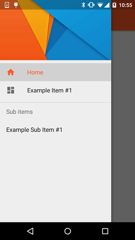
Example
Step 1
Add the Design Support Library to your build.gradle file
dependencies { // Other dependencies like appcompat compile 'com.android.support:design:22.2.0'}Step 2
Add the NavigationView to your DrawerLayout:
<android.support.v4.widget.DrawerLayout xmlns:android="http://schemas.android.com/apk/res/android" xmlns:app="http://schemas.android.com/apk/res-auto" android:id="@+id/drawer_layout" android:layout_width="match_parent" android:layout_height="match_parent" android:fitsSystemWindows="true"> <!-- this is important --> <!-- Your contents --> <android.support.design.widget.NavigationView android:id="@+id/navigation" android:layout_width="wrap_content" android:layout_height="match_parent" android:layout_gravity="start" app:menu="@menu/navigation_items" /> <!-- The items to display --> </android.support.v4.widget.DrawerLayout>Step 3
Create a new menu-resource in /res/menu and add the items and icons you wanna display:
<menu xmlns:android="http://schemas.android.com/apk/res/android"> <group android:checkableBehavior="single"> <item android:id="@+id/nav_home" android:icon="@drawable/ic_action_home" android:title="Home" /> <item android:id="@+id/nav_example_item_1" android:icon="@drawable/ic_action_dashboard" android:title="Example Item #1" /> </group> <item android:title="Sub items"> <menu> <item android:id="@+id/nav_example_sub_item_1" android:title="Example Sub Item #1" /> </menu> </item></menu>Step 4
Init the NavigationView and handle click events:
public class MainActivity extends AppCompatActivity { NavigationView mNavigationView; DrawerLayout mDrawerLayout; // Other stuff private void init() { mDrawerLayout = (DrawerLayout) findViewById(R.id.drawer_layout); mNavigationView = (NavigationView) findViewById(R.id.navigation_view); mNavigationView.setNavigationItemSelectedListener(new NavigationView.OnNavigationItemSelectedListener() { @Override public boolean onNavigationItemSelected(MenuItem menuItem) { mDrawerLayout.closeDrawers(); menuItem.setChecked(true); switch (menuItem.getItemId()) { case R.id.nav_home: // TODO - Do something break; // TODO - Handle other items } return true; } }); }}Step 5
Be sure to set android:windowDrawsSystemBarBackgrounds and android:statusBarColor in values-v21 otherwise your Drawer won`t be displayed "under" the StatusBar
<style name="AppTheme" parent="Theme.AppCompat.Light.NoActionBar"> <!-- Other attributes like colorPrimary, colorAccent etc. --> <item name="android:windowDrawsSystemBarBackgrounds">true</item> <item name="android:statusBarColor">@android:color/transparent</item></style>Optional Step
Add a Header to the NavigationView. For this simply create a new layout and add app:headerLayout="@layout/my_header_layout" to the NavigationView.
Result
Notes
- The highlighted color uses the color defined via the
colorPrimaryattribute - The List Items use the color defined via the
textColorPrimaryattribute - The Icons use the color defined via the
textColorSecondaryattribute
You can also check the example app by Chris Banes which highlights the NavigationView along with the other new views that are part of the Design Support Library (like the FloatingActionButton, TextInputLayout, Snackbar, TabLayout etc.)