how to change color of TextinputLayout's label and edittext underline android
Change bottom line color:
<item name="colorControlNormal">#c5c5c5</item><item name="colorControlActivated">@color/accent</item><item name="colorControlHighlight">@color/accent</item>For more info check this thread.
Change hint color when it is floating
<style name="MyHintStyle" parent="@android:style/TextAppearance"> <item name="android:textColor">@color/main_color</item></style>and use it like this:
<android.support.design.widget.TextInputLayout ... app:hintTextAppearance="@style/MyHintStyle">Change hint color when it is not a floating label:
<android.support.design.widget.TextInputLayout ... app:hintTextAppearance="@style/MyHintStyle" android:textColorHint="#c1c2c4">Thanks to @AlbAtNf
Based on Fedor Kazakov and others answers, I created a default config.
styles.xml
<resources> <!-- Base application theme. --> <style name="AppTheme" parent="Theme.AppCompat.Light"> <!-- Customize your theme here. --> <item name="colorPrimary">@color/colorPrimary</item> <item name="colorPrimaryDark">@color/colorPrimaryDark</item> <item name="colorAccent">@color/colorAccent</item> </style> <style name="Widget.Design.TextInputLayout" parent="AppTheme"> <item name="hintTextAppearance">@style/AppTheme.TextFloatLabelAppearance</item> <item name="errorTextAppearance">@style/AppTheme.TextErrorAppearance</item> <item name="counterTextAppearance">@style/TextAppearance.Design.Counter</item> <item name="counterOverflowTextAppearance">@style/TextAppearance.Design.Counter.Overflow</item> </style> <style name="AppTheme.TextFloatLabelAppearance" parent="TextAppearance.Design.Hint"> <!-- Floating label appearance here --> <item name="android:textColor">@color/colorAccent</item> <item name="android:textSize">20sp</item> </style> <style name="AppTheme.TextErrorAppearance" parent="TextAppearance.Design.Error"> <!-- Error message appearance here --> <item name="android:textColor">#ff0000</item> <item name="android:textSize">20sp</item> </style></resources>activity_layout.xml
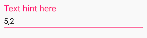
<android.support.design.widget.TextInputLayout android:layout_width="match_parent" android:layout_height="wrap_content"> <android.support.v7.widget.AppCompatEditText android:layout_width="match_parent" android:layout_height="wrap_content" android:hint="Text hint here" android:text="5,2" /></android.support.design.widget.TextInputLayout>Focused:
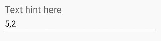
Without focus:
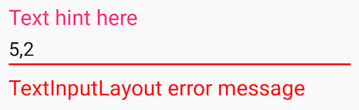
Error message:
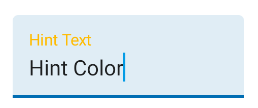
With the Material Components Library you can use the com.google.android.material.textfield.TextInputLayout.
You can apply a custom style to change the colors.
To change the hint color you have to use these attributes:hintTextColor and android:textColorHint.
<style name="Custom_textinputlayout_filledbox" parent="@style/Widget.MaterialComponents.TextInputLayout.FilledBox"> <!-- The color of the label when it is collapsed and the text field is active --> <item name="hintTextColor">?attr/colorPrimary</item> <!-- The color of the label in all other text field states (such as resting and disabled) --> <item name="android:textColorHint">@color/selector_hint_text_color</item></style>You should use a selector for the android:textColorHint. Something like:
<selector xmlns:android="http://schemas.android.com/apk/res/android"> <item android:alpha="0.38" android:color="?attr/colorOnSurface" android:state_enabled="false"/> <item android:alpha="0.6" android:color="?attr/colorOnSurface"/></selector>To change the bottom line color you have to use the attribute: boxStrokeColor.
<style name="Custom_textinputlayout_filledbox" parent="@style/Widget.MaterialComponents.TextInputLayout.FilledBox"> .... <item name="boxStrokeColor">@color/selector_stroke_color</item></style>Also in this case you should use a selector. Something like:
<selector xmlns:android="http://schemas.android.com/apk/res/android"> <item android:color="?attr/colorPrimary" android:state_focused="true"/> <item android:alpha="0.87" android:color="?attr/colorOnSurface" android:state_hovered="true"/> <item android:alpha="0.12" android:color="?attr/colorOnSurface" android:state_enabled="false"/> <item android:alpha="0.38" android:color="?attr/colorOnSurface"/></selector>
You can also apply these attributes in your layout:
<com.google.android.material.textfield.TextInputLayout style="@style/Widget.MaterialComponents.TextInputLayout.FilledBox" app:boxStrokeColor="@color/selector_stroke_color" app:hintTextColor="?attr/colorPrimary" android:textColorHint="@color/selector_hint_text_color" ...>