How to implement a material design circular progress bar in android
<ProgressBarandroid:id="@+id/loading_spinner"android:layout_width="wrap_content"android:layout_height="wrap_content"android:indeterminateTintMode="src_atop"android:indeterminateTint="@color/your_customized_color"android:layout_gravity="center" />The effect looks like this:
Nice implementation for material design circular progress bar (from rahatarmanahmed/CircularProgressView),
<com.github.rahatarmanahmed.cpv.CircularProgressView xmlns:app="http://schemas.android.com/apk/res-auto" android:id="@+id/progress_view" android:layout_width="40dp" android:layout_height="40dp" app:cpv_indeterminate="true"/>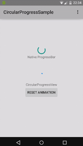
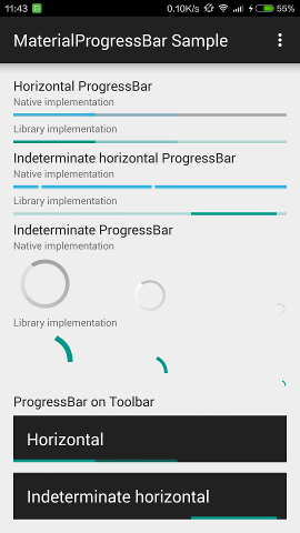
I've backported the three Material Design progress drawables to Android 4.0, which can be used as a drop-in replacement for regular ProgressBar, with exactly the same appearance.
These drawables also backported the tinting APIs (and RTL support), and uses ?colorControlActivated as the default tint. A MaterialProgressBar widget which extends ProgressBar has also been introduced for convenience.
DreaminginCodeZH/MaterialProgressBar
This project has also been adopted by afollestad/material-dialogs for progress dialog.
On Android 4.4.4:
On Android 5.1.1:
