How to set the divider between Tabs in TabLayout of design support library?
TabLayout is actually HorizontalScrollView and it's first child is LinearLayout.
So just use below code to add dividers
View root = tabLayout.getChildAt(0); if (root instanceof LinearLayout) { ((LinearLayout) root).setShowDividers(LinearLayout.SHOW_DIVIDER_MIDDLE); GradientDrawable drawable = new GradientDrawable(); drawable.setColor(getResources().getColor(R.color.separator)); drawable.setSize(2, 1); ((LinearLayout) root).setDividerPadding(10); ((LinearLayout) root).setDividerDrawable(drawable); }Below is the sample screen shot
Screen 1
Screen 2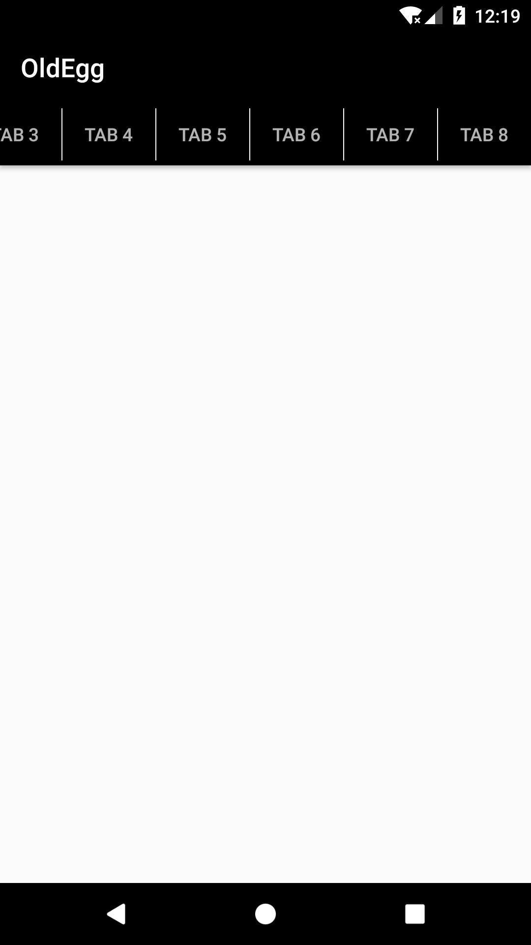
There is a way to add divider by using Tab setCustomView method:
TabLayout tabLayout = (TabLayout) findViewById(R.id.tablayout);tabLayout.setupWithViewPager(viewPager);for (int i = 0; i < tabLayout.getTabCount(); i++) { TabLayout.Tab tab = tabLayout.getTabAt(i); RelativeLayout relativeLayout = (RelativeLayout) LayoutInflater.from(this).inflate(R.layout.tab_layout, tabLayout, false); TextView tabTextView = (TextView) relativeLayout.findViewById(R.id.tab_title); tabTextView.setText(tab.getText()); tab.setCustomView(relativeLayout); tab.select();}Tab custom layout with divider (tab_layout.xml):
<?xml version="1.0" encoding="utf-8"?><RelativeLayout xmlns:android="http://schemas.android.com/apk/res/android" android:layout_width="match_parent" android:layout_height="match_parent" ><!-- Tab title --><TextView android:id="@+id/tab_title" android:layout_width="match_parent" android:layout_height="match_parent" android:gravity="center" android:textColor="@drawable/tab_item_selector"/><!-- Tab divider --><View android:layout_width="1dp" android:layout_height="match_parent" android:layout_alignParentLeft="true" android:background="@android:color/black" /></RelativeLayout>Set TabLayout tab horizontal padding to 0dp:
<android.support.design.widget.TabLayout android:id="@+id/tablayout" android:layout_width="match_parent" android:layout_height="wrap_content" android:background="@drawable/shape_tabbar_background" app:tabIndicatorColor="@android:color/white" app:tabIndicatorHeight="4dp" app:tabPaddingStart="0dp" app:tabPaddingEnd="0dp" />And a selector for tab title text color when it's selected (tab_item_selector.xml):
<?xml version="1.0" encoding="utf-8"?><selector xmlns:android="http://schemas.android.com/apk/res/android"> <item android:state_selected="true" android:color="@color/abc_primary_text_material_dark" /> <item android:state_focused="true" android:color="@color/abc_primary_text_material_dark" /> <item android:state_pressed="true" android:color="@color/abc_primary_text_material_dark" /> <item android:color="@color/abc_secondary_text_material_dark" /></selector>
I do not think it is possible though unless during Tab creation you specify a customView and add your divider so for instance; a TextView and you explicitly TextView.setCompoundDrawablesWithIntrinsicBounds(0, 0,(int)id_of_a_divider, 0);
like you try to detect if its the first Tab,
if(firstTab){ tabLayout.getTabAt(0).getCustomView() .setCompoundDrawablesWithIntrinsicBounds(0, 0,(int)id_of_a_divider, 0); //some little casting}else if(lastTab){ //dont get any tabLayout.getTabAt(index).getCustomView() .setCompoundDrawablesWithIntrinsicBounds(0,0,0, 0); else{ //the rest takes two sides, tabLayout.getTabAt(index).getCustomView() .setCompoundDrawablesWithIntrinsicBounds((int)id_of_a_divider , 0,(int)id_of_a_divider, 0);i hope you, get my idea