Implementing SearchView as per the material design guidelines
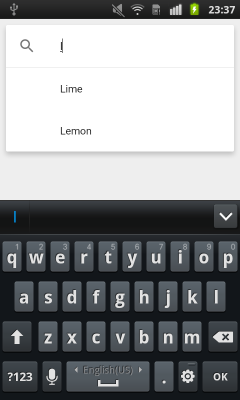
I tried several material SearchView libraries, but none of them worked good as the one from the support library, so I decided to redesign it, after a lot of work, I am pleased with the result:
Here is how you can do it:
1) Add SearchView item to your menu
<item android:id="@+id/m_search" android:icon="@drawable/ic_action_search" android:title="@string/search_title" app:actionLayout="@layout/search_view_layout" app:showAsAction="ifRoom|collapseActionView" />Notice that I'm declaring actionLayout instead of actionViewClass, I figured that this is the only way to set SearchView theme separately from Toolbar theme.
search_view_layout.xml:
<android.support.v7.widget.SearchView android:id="@+id/search_view" android:layout_width="match_parent" android:layout_height="wrap_content" android:theme="@style/SearchViewTheme" />2) Add the custom SearchView theme to your styles, declare SearchView theme in your Toolbar theme as well:
<style name="SearchViewTheme" parent="Widget.AppCompat.SearchView.ActionBar"> <item name="layout">@layout/toolbar_search_view</item> <item name="commitIcon">@drawable/ic_search_commit</item> <item name="colorControlNormal">@color/material_light_active_icon</item> <item name="colorControlHighlight">@color/material_ripple_light</item> <item name="autoCompleteTextViewStyle">@style/AutoCompleteTextViewStyle</item> <item name="suggestionRowLayout">@layout/search_view_suggestion_row</item> <item name="android:maxWidth">9999dp</item></style><style name="AutoCompleteTextViewStyle" parent="Widget.AppCompat.Light.AutoCompleteTextView"> <item name="android:popupBackground">@drawable/search_suggestions_bg</item> <item name="android:popupElevation">0dp</item></style><style name="ToolbarTheme" parent="ThemeOverlay.AppCompat.Dark.ActionBar"> <item name="searchViewStyle">@style/SearchViewTheme</item></style>toolbar_search_view.xml:
<LinearLayout xmlns:android="http://schemas.android.com/apk/res/android" android:id="@+id/search_bar" android:layout_width="match_parent" android:layout_height="match_parent" android:orientation="horizontal" android:paddingEnd="8dp"><!-- This is actually used for the badge icon *or* the badge label (or neither) --><TextView android:id="@+id/search_badge" android:layout_width="wrap_content" android:layout_height="match_parent" android:layout_marginBottom="2dp" android:drawablePadding="0dp" android:gravity="center_vertical" android:textAppearance="?android:attr/textAppearanceMedium" android:textColor="?android:attr/textColorPrimary" android:visibility="gone" /><ImageView android:id="@+id/search_button" style="?attr/actionButtonStyle" android:layout_width="wrap_content" android:layout_height="match_parent" android:layout_gravity="center_vertical" android:contentDescription="@string/abc_searchview_description_search" android:focusable="true" /><LinearLayout android:id="@+id/search_edit_frame" android:layout_width="0dp" android:layout_height="match_parent" android:layout_weight="1" android:layoutDirection="locale" android:orientation="horizontal"> <ImageView android:id="@+id/search_mag_icon" style="@style/RtlOverlay.Widget.AppCompat.SearchView.MagIcon" android:layout_width="@dimen/abc_dropdownitem_icon_width" android:layout_height="wrap_content" android:layout_gravity="center_vertical" android:scaleType="centerInside" android:visibility="gone" /> <!-- Inner layout contains the app icon, button(s) and EditText --> <LinearLayout android:id="@+id/search_plate" android:layout_width="0dp" android:layout_height="match_parent" android:layout_gravity="center_vertical" android:layout_weight="1" android:orientation="horizontal"> <view android:id="@+id/search_src_text" class="android.support.v7.widget.SearchView$SearchAutoComplete" android:layout_width="0dp" android:layout_height="match_parent" android:layout_gravity="center_vertical" android:layout_marginEnd="@dimen/item_list_horizontal_margin" android:layout_marginStart="@dimen/item_list_horizontal_margin" android:layout_weight="1" android:background="@null" android:dropDownAnchor="@id/anchor_dropdown" android:dropDownHeight="wrap_content" android:dropDownHorizontalOffset="0dp" android:dropDownVerticalOffset="0dp" android:ellipsize="end" android:imeOptions="actionSearch" android:inputType="text|textAutoComplete|textNoSuggestions" android:maxLines="1" android:paddingEnd="8dp" android:textColor="@android:color/black" android:textColorHint="@color/material_light_hint_text" android:textSize="20sp" /> <ImageView android:id="@+id/search_close_btn" android:layout_width="wrap_content" android:layout_height="match_parent" android:layout_gravity="center_vertical" android:background="?attr/selectableItemBackgroundBorderless" android:contentDescription="@string/abc_searchview_description_clear" android:focusable="true" android:paddingEnd="8dp" android:paddingStart="8dp" /> </LinearLayout> <LinearLayout android:id="@+id/submit_area" android:layout_width="wrap_content" android:layout_height="match_parent" android:orientation="horizontal"> <ImageView android:id="@+id/search_go_btn" android:layout_width="wrap_content" android:layout_height="match_parent" android:layout_gravity="center_vertical" android:background="?attr/selectableItemBackgroundBorderless" android:contentDescription="@string/abc_searchview_description_submit" android:focusable="true" android:paddingEnd="8dp" android:paddingStart="8dp" android:visibility="gone" /> <ImageView android:id="@+id/search_voice_btn" android:layout_width="wrap_content" android:layout_height="match_parent" android:layout_gravity="center_vertical" android:background="?attr/selectableItemBackgroundBorderless" android:contentDescription="@string/abc_searchview_description_voice" android:focusable="true" android:paddingEnd="8dp" android:paddingStart="8dp" android:visibility="gone" /> </LinearLayout></LinearLayout>Notice that I added anchor dropdown view under the Toolbar view, so suggestions will get full screen width.
<android.support.design.widget.AppBarLayout xmlns:android="http://schemas.android.com/apk/res/android" xmlns:app="http://schemas.android.com/apk/res-auto" android:id="@+id/appBar" android:layout_width="match_parent" android:layout_height="wrap_content"><android.support.v7.widget.Toolbar android:id="@+id/toolbar" android:layout_width="match_parent" android:layout_height="?attr/actionBarSize" android:background="?attr/colorPrimary" app:collapseIcon="@drawable/ic_search_collapse" app:popupTheme="@style/AppTheme.PopupOverlay" app:theme="@style/ToolbarTheme" /><View android:id="@+id/anchor_dropdown" android:layout_width="match_parent" android:layout_height="0dp" /></android.support.design.widget.AppBarLayout>search_view_suggestion_row.xml:
(change suggestion_divider visibility if you want divider between suggestions):
<RelativeLayout xmlns:android="http://schemas.android.com/apk/res/android" android:layout_width="match_parent" android:layout_height="58dp" android:theme="@style/Theme.AppCompat.DayNight"><!-- Icons come first in the layout, since their placement doesn't depend on the placement of the text views. --><ImageView android:id="@android:id/icon1" style="@style/RtlOverlay.Widget.AppCompat.Search.DropDown.Icon1" android:layout_width="56dp" android:layout_height="56dp" android:layout_alignParentBottom="true" android:layout_alignParentTop="true" android:scaleType="centerInside" android:visibility="invisible" /><ImageView android:id="@+id/edit_query" style="@style/RtlOverlay.Widget.AppCompat.Search.DropDown.Query" android:layout_width="56dp" android:layout_height="56dp" android:layout_alignParentBottom="true" android:layout_alignParentTop="true" android:background="?attr/selectableItemBackground" android:scaleType="centerInside" android:visibility="gone" /><ImageView android:id="@id/android:icon2" style="@style/RtlOverlay.Widget.AppCompat.Search.DropDown.Icon2" android:layout_width="56dp" android:layout_height="56dp" android:layout_alignParentBottom="true" android:layout_alignParentTop="true" android:layout_alignWithParentIfMissing="true" android:scaleType="centerInside" android:visibility="gone" /><!-- The subtitle comes before the title, since the height of the title depends on whether the subtitle is visible or gone. --><TextView android:id="@android:id/text2" style="?android:attr/dropDownItemStyle" android:layout_width="match_parent" android:layout_height="29dp" android:layout_alignParentBottom="true" android:layout_alignWithParentIfMissing="true" android:gravity="top" android:maxLines="1" android:paddingBottom="4dp" android:textColor="?android:textColorSecondary" android:textSize="12sp" android:visibility="gone" /><!-- The title is placed above the subtitle, if there is one. If there is no subtitle, it fills the parent. --><TextView android:id="@android:id/text1" style="?android:attr/dropDownItemStyle" android:layout_width="match_parent" android:layout_height="wrap_content" android:layout_above="@android:id/text2" android:layout_centerVertical="true" android:ellipsize="end" android:maxLines="1" android:scrollHorizontally="false" android:textColor="?android:textColorPrimary" android:textSize="16sp" /><View android:id="@+id/suggestion_divider" android:layout_width="match_parent" android:layout_height="0.5dp" android:layout_alignParentBottom="true" android:layout_alignStart="@android:id/text1" android:layout_marginStart="8dp" android:background="@color/divider_color" android:visibility="gone" />The suggestions background and the commit icon are custom made, the rest of the icons I used can be found at: https://material.io/icons/
ic_search_commit.xml:
<vector xmlns:android="http://schemas.android.com/apk/res/android" android:width="24dp" android:height="24dp" android:autoMirrored="true" android:viewportHeight="24.0" android:viewportWidth="24.0"> <path android:fillColor="@color/active_icon_color" android:pathData="m18.364,16.95l-8.605,-8.605l7.905,-0l-0.007,-2.001l-11.314,0l0,11.314l1.994,-0l0.007,-7.898l8.605,8.605l1.414,-1.414z" />search_suggestions_bg.xml:
<layer-list xmlns:android="http://schemas.android.com/apk/res/android"><item> <shape android:shape="rectangle"> <padding android:top="0.5dp" /> <stroke android:width="0.5dp" android:color="@color/divider_color" /> </shape></item><item> <shape android:shape="rectangle"> <solid android:color="@color/cards_and_dialogs_color" /> </shape></item></layer-list>Add following values to your colors.xml (add values-night only if you are using DayNight theme):
values/colors.xml
<color name="material_light_primary_text">#DE000000</color><color name="material_light_hint_text">#61000000</color><color name="material_light_active_icon">#8A000000</color><color name="material_ripple_light">#1F000000</color><color name="divider_color">#1F000000</color><color name="active_icon_color">#8A000000</color><color name="cards_and_dialogs_color">@android:color/white</color><color name="quantum_grey_600">#757575</color>values-night/colors.xml:
<color name="divider_color">#1FFFFFFF</color><color name="active_icon_color">@android:color/white</color><color name="cards_and_dialogs_color">#424242</color>3) Last part, make the magic happen in code:
Setup and initialize SearchView in your desired activity
private MenuItem mSearchItem;private Toolbar mToolbar;@Overrideprotected void onCreate(Bundle savedInstanceState) { super.onCreate(savedInstanceState); ... mToolbar = (Toolbar) findViewById(R.id.toolbar); setSupportActionBar(mToolbar);}@Overridepublic boolean onCreateOptionsMenu(Menu menu) { getMenuInflater().inflate(R.menu.main, menu); mSearchItem = menu.findItem(R.id.m_search); MenuItemCompat.setOnActionExpandListener(mSearchItem, new MenuItemCompat.OnActionExpandListener() { @Override public boolean onMenuItemActionCollapse(MenuItem item) { // Called when SearchView is collapsing if (mSearchItem.isActionViewExpanded()) { animateSearchToolbar(1, false, false); } return true; } @Override public boolean onMenuItemActionExpand(MenuItem item) { // Called when SearchView is expanding animateSearchToolbar(1, true, true); return true; } }); return true;}public void animateSearchToolbar(int numberOfMenuIcon, boolean containsOverflow, boolean show) { mToolbar.setBackgroundColor(ContextCompat.getColor(this, android.R.color.white)); mDrawerLayout.setStatusBarBackgroundColor(ContextCompat.getColor(this, R.color.quantum_grey_600)); if (show) { if (Build.VERSION.SDK_INT >= Build.VERSION_CODES.LOLLIPOP) { int width = mToolbar.getWidth() - (containsOverflow ? getResources().getDimensionPixelSize(R.dimen.abc_action_button_min_width_overflow_material) : 0) - ((getResources().getDimensionPixelSize(R.dimen.abc_action_button_min_width_material) * numberOfMenuIcon) / 2); Animator createCircularReveal = ViewAnimationUtils.createCircularReveal(mToolbar, isRtl(getResources()) ? mToolbar.getWidth() - width : width, mToolbar.getHeight() / 2, 0.0f, (float) width); createCircularReveal.setDuration(250); createCircularReveal.start(); } else { TranslateAnimation translateAnimation = new TranslateAnimation(0.0f, 0.0f, (float) (-mToolbar.getHeight()), 0.0f); translateAnimation.setDuration(220); mToolbar.clearAnimation(); mToolbar.startAnimation(translateAnimation); } } else { if (Build.VERSION.SDK_INT >= Build.VERSION_CODES.LOLLIPOP) { int width = mToolbar.getWidth() - (containsOverflow ? getResources().getDimensionPixelSize(R.dimen.abc_action_button_min_width_overflow_material) : 0) - ((getResources().getDimensionPixelSize(R.dimen.abc_action_button_min_width_material) * numberOfMenuIcon) / 2); Animator createCircularReveal = ViewAnimationUtils.createCircularReveal(mToolbar, isRtl(getResources()) ? mToolbar.getWidth() - width : width, mToolbar.getHeight() / 2, (float) width, 0.0f); createCircularReveal.setDuration(250); createCircularReveal.addListener(new AnimatorListenerAdapter() { @Override public void onAnimationEnd(Animator animation) { super.onAnimationEnd(animation); mToolbar.setBackgroundColor(getThemeColor(MainActivity.this, R.attr.colorPrimary)); mDrawerLayout.setStatusBarBackgroundColor(getThemeColor(MainActivity.this, R.attr.colorPrimaryDark)); } }); createCircularReveal.start(); } else { AlphaAnimation alphaAnimation = new AlphaAnimation(1.0f, 0.0f); Animation translateAnimation = new TranslateAnimation(0.0f, 0.0f, 0.0f, (float) (-mToolbar.getHeight())); AnimationSet animationSet = new AnimationSet(true); animationSet.addAnimation(alphaAnimation); animationSet.addAnimation(translateAnimation); animationSet.setDuration(220); animationSet.setAnimationListener(new Animation.AnimationListener() { @Override public void onAnimationStart(Animation animation) { } @Override public void onAnimationEnd(Animation animation) { mToolbar.setBackgroundColor(getThemeColor(MainActivity.this, R.attr.colorPrimary)); } @Override public void onAnimationRepeat(Animation animation) { } }); mToolbar.startAnimation(animationSet); } mDrawerLayout.setStatusBarBackgroundColor(getThemeColor(MainActivity.this, R.attr.colorPrimaryDark)); }}private boolean isRtl(Resources resources) { return resources.getConfiguration().getLayoutDirection() == View.LAYOUT_DIRECTION_RTL;}private static int getThemeColor(Context context, int id) { Resources.Theme theme = context.getTheme(); TypedArray a = theme.obtainStyledAttributes(new int[]{id}); int result = a.getColor(0, 0); a.recycle(); return result;}Few things to notice about the code:
1) The animation will adjust it's start point based on your set of number of menu items and if the toolbar has overflow icon, it will detect if layout is LTR or RTL automatically.
2) I'm using navigation drawer activity, so I set StatusBar color to mDrawerLayout, if you are using regular activity, you can set StatusBar color this way:
getWindow().setStatusBarColor(ContextCompat.getColor(this, R.color.quantum_grey_600));3) The circular reveal animation will only work on KitKat and above.
It is actually quite easy to do this, if you are using android.support.v7 library.
Step - 1
Declare a menu item
<item android:id="@+id/action_search"android:title="Search"android:icon="@drawable/abc_ic_search_api_mtrl_alpha"app:showAsAction="ifRoom|collapseActionView"app:actionViewClass="android.support.v7.widget.SearchView" />Step - 2
Extend AppCompatActivity and in the onCreateOptionsMenu setup the SearchView.
import android.support.v7.widget.SearchView;public class YourActivity extends AppCompatActivity { ... @Override public boolean onCreateOptionsMenu(Menu menu) { getMenuInflater().inflate(R.menu.menu_home, menu); // Retrieve the SearchView and plug it into SearchManager final SearchView searchView = (SearchView) MenuItemCompat.getActionView(menu.findItem(R.id.action_search)); SearchManager searchManager = (SearchManager) getSystemService(SEARCH_SERVICE); searchView.setSearchableInfo(searchManager.getSearchableInfo(getComponentName())); return true; } ... }
The idea is very simple - you have to write your own AutoCompleteTextView using EditText, TextWatcher and RecyclerView with Filterable adapter.
- EditText gives you a text field with ability to input characters
- TextWatcher allows you to watch for text changes
- RecyclerView can be placed anywhere, so you can show the search results just like on your screenshot
- Filterable adapter helps to present data filtered with the entered text
So:
- make a layout with EditText on the top, with RecyclerView filling the remaining space. Add the icon, shadow, etc.
- add a TextWatcher and update the adapter on each text change
If you'd like to see my solution in action, check out my project on github:https://github.com/ZieIony/Carbon
The Auto complete demo can be sound in the sample app in 'Demos' section.