Material Design not styling alert dialogs
UPDATED ON Aug 2019 WITH The Material components for android library:
With the new Material components for Android library you can use the new com.google.android.material.dialog.MaterialAlertDialogBuilder class, which extends from the existing androidx.appcompat.AlertDialog.Builder class and provides support for the latest Material Design specifications.
Just use something like this:
new MaterialAlertDialogBuilder(context) .setTitle("Dialog") .setMessage("Lorem ipsum dolor ....") .setPositiveButton("Ok", /* listener = */ null) .setNegativeButton("Cancel", /* listener = */ null) .show();You can customize the colors extending the ThemeOverlay.MaterialComponents.MaterialAlertDialog style:
<style name="CustomMaterialDialog" parent="@style/ThemeOverlay.MaterialComponents.MaterialAlertDialog"> <!-- Background Color--> <item name="android:background">#006db3</item> <!-- Text Color for title and message --> <item name="colorOnSurface">@color/secondaryColor</item> <!-- Text Color for buttons --> <item name="colorPrimary">@color/white</item> .... </style> To apply your custom style just use the constructor:
new MaterialAlertDialogBuilder(context, R.style.CustomMaterialDialog)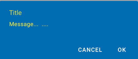
To customize the buttons, the title and the body text check this post for more details.
You can also change globally the style in your app theme:
<!-- Base application theme. --> <style name="AppTheme" parent="Theme.MaterialComponents.Light"> ... <item name="materialAlertDialogTheme">@style/CustomMaterialDialog</item> </style>WITH SUPPORT LIBRARY and APPCOMPAT THEME:
With the new AppCompat v22.1 you can use the new android.support.v7.app.AlertDialog.
Just use a code like this:
import android.support.v7.app.AlertDialogAlertDialog.Builder builder = new AlertDialog.Builder(this, R.style.AppCompatAlertDialogStyle);builder.setTitle("Dialog");builder.setMessage("Lorem ipsum dolor ....");builder.setPositiveButton("OK", null);builder.setNegativeButton("Cancel", null);builder.show();And use a style like this:
<style name="AppCompatAlertDialogStyle" parent="Theme.AppCompat.Light.Dialog.Alert"> <item name="colorAccent">#FFCC00</item> <item name="android:textColorPrimary">#FFFFFF</item> <item name="android:background">#5fa3d0</item> </style>Otherwise you can define in your current theme:
<style name="AppTheme" parent="Theme.AppCompat.Light"> <!-- your style --> <item name="alertDialogTheme">@style/AppCompatAlertDialogStyle</item></style>and then in your code:
import android.support.v7.app.AlertDialog AlertDialog.Builder builder = new AlertDialog.Builder(this);Here the AlertDialog on Kitkat: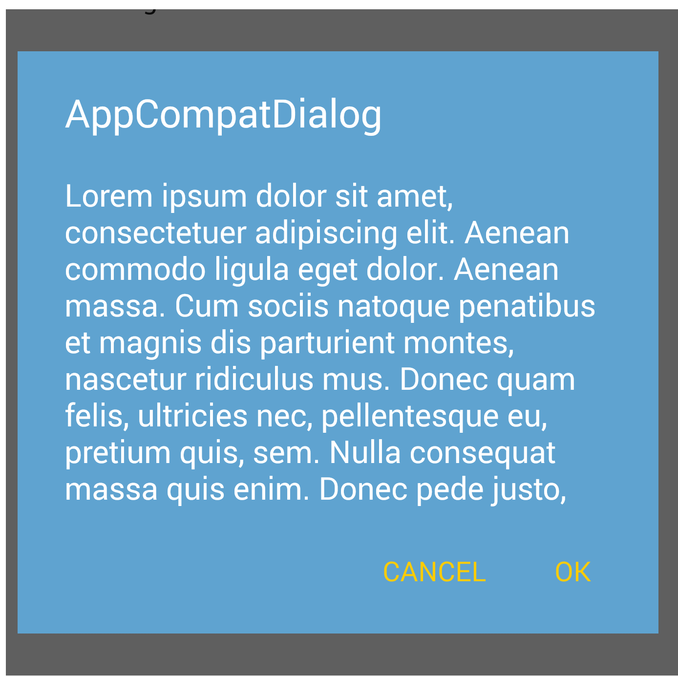
when initializing dialog builder, pass second parameter as the theme. It will automatically show material design with API level 21.
AlertDialog.Builder builder = new AlertDialog.Builder(this, AlertDialog.THEME_DEVICE_DEFAULT_DARK);or,
AlertDialog.Builder builder = new AlertDialog.Builder(this, AlertDialog.THEME_DEVICE_DEFAULT_LIGHT);
AppCompat doesn't do that for dialogs (not yet at least)
EDIT: it does now. make sure to use android.support.v7.app.AlertDialog