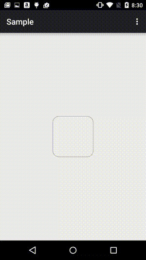
Shaped drawable with selectableItemBackground as background
Having round_corners.xml:
<?xml version="1.0" encoding="utf-8"?><shape xmlns:android="http://schemas.android.com/apk/res/android" android:shape="rectangle"> <solid android:color="@android:color/transparent"/> <corners android:radius="15dp" /> <stroke android:width="1px" android:color="#000000" /></shape>And my_ripple.xml:
<?xml version="1.0" encoding="utf-8"?><ripple xmlns:android="http://schemas.android.com/apk/res/android" android:color="?android:attr/colorControlHighlight"> <item android:id="@android:id/mask"> <shape android:shape="rectangle"> <solid android:color="#000000" /> <corners android:radius="15dp" /> </shape> </item> <item android:drawable="@drawable/round_corners" /></ripple>And button:
<Button android:background="@drawable/my_ripple" ... />Will result in this:
See this article.
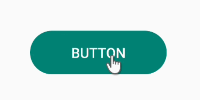
I have a simpler version of the first answer:
<ripple xmlns:android="http://schemas.android.com/apk/res/android" android:color="?colorControlHighlight"> <!-- default ripple color --> <item> <!-- the background shape when it's not being clicked --> <shape android:shape="rectangle"> <solid android:color="@color/colorPrimary" /> <corners android:radius="32dp" /> </shape> </item></ripple>Just apply it as background but remember to REMOVE THE SHADOW if it applys to Button:
style="?borderlessButtonStyle"
Good luck!
Here's a simpler solution now in 2020 (API >= 21 because we're using the ?attr syntax) :
<ripple xmlns:android="http://schemas.android.com/apk/res/android" android:color="?colorControlHighlight"> <!-- 🡡 the ripple's color (1) --> <!-- 🡣 no `id` so our <shape> will be drawn and not just used as mask --> <item> <shape> <corners android:radius="9dp" /> <solid android:color="@color/white" /> </shape> </item></ripple>
(1)If you don't overridecolorControlHighlightin your theme, the ripple's color will be Android's default. If you do override it but still want to use Android's default use?android:colorControlHighlightinstead