What's the name of the little widget with three dots inside a cardview in android?
This is not a widget at all. It is an ImageButton (borderless in style) using the overflow Icon that includes a PopupMenu
For documentation tutorial visits http://developer.android.com/guide/topics/ui/menus.html#PopupMenu
This refers to a nice code snippet from the link above:
<ImageButton android:layout_width="wrap_content" android:layout_height="wrap_content" android:src="@drawable/ic_overflow_holo_dark" android:contentDescription="@string/descr_overflow_button" android:onClick="showPopup" />Then use to show popup:
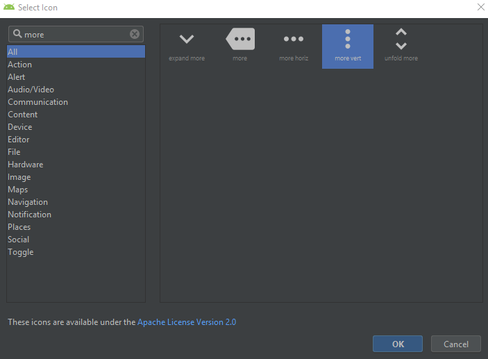
public void showPopup(View v) { PopupMenu popup = new PopupMenu(this, v); MenuInflater inflater = popup.getMenuInflater(); inflater.inflate(R.menu.actions, popup.getMenu()); popup.show(); }3-Dots button is available among Assets in Android Studio:
Right click on res -> New -> Vector Assets -> Asset Type = Clip Art
-> Click on the button next to Clip Art: label -> Search for more vert
You may also simply use an ImageButton with the actionOverflowButtonStyle style attribute.
<ImageButton android:layout_width="wrap_content" android:layout_height="wrap_content" style="?android:attr/actionOverflowButtonStyle"/>
The "original" three dot widget is the android.widget.ActionMenuPresenter.OverflowMenuButton (ActionMenuPresenter.java). Sadly it is a private class. Here a working shorter version:
public class OverflowMenuButton extends AppCompatImageView{ public OverflowMenuButton(Context context) { this(context, null); } public OverflowMenuButton(Context context, AttributeSet attrs) { this(context, attrs, 0); } public OverflowMenuButton(Context context, AttributeSet attrs, int defStyleAttr) { super(new ContextThemeWrapper(context, R.style.OverflowButtonTheme), attrs, R.attr.actionOverflowButtonStyle); setClickable(true); setFocusable(true); setVisibility(VISIBLE); setEnabled(true); }}Themes of the ContextThemeWrapper to get a dark and light version:
<!--White dots theme--><style name="OverflowButtonTheme" parent="@style/Theme.AppCompat"> <item name="actionOverflowButtonStyle">@style/Widget.AppCompat.ActionButton.Overflow</item></style><!--Dark dots theme--><style name="OverflowButtonThemeLight" parent="@style/Theme.AppCompat.Light"> <item name="actionOverflowButtonStyle">@style/Widget.AppCompat.Light.ActionButton.Overflow</item></style>