sliver app bar with search functionality in flutter
This is a solution to make the search bar fixed and stop it from shrinking:
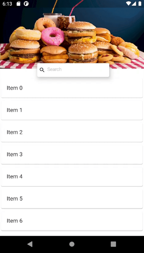
You can use two SilverAppBars, one for the background image and one for the search bar. The first SilverAppBar has no title and elevation and is not pinned. The second SilverAppBar is pinned and has elevation and its title is the SearchBar.
@override Widget build(BuildContext context) { return Scaffold( backgroundColor: Colors.white, body: NestedScrollView( headerSliverBuilder: (BuildContext context, bool innerBoxScrolled) { return <Widget>[ createSilverAppBar1(), createSilverAppBar2() ]; }, body: ListView.builder( itemCount: itemList.length, itemBuilder: (context, index) { return Card( child: ListTile( title: Text(itemList[index]), ), ); })), ); } SliverAppBar createSilverAppBar1() { return SliverAppBar( backgroundColor: Colors.redAccent, expandedHeight: 300, floating: false, elevation: 0, flexibleSpace: LayoutBuilder( builder: (BuildContext context, BoxConstraints constraints) { return FlexibleSpaceBar( collapseMode: CollapseMode.parallax, background: Container( color: Colors.white, child: Image.asset( 'assets/mainBackImage.jpg', fit: BoxFit.cover, ), ), ); }), ); } SliverAppBar createSilverAppBar2() { return SliverAppBar( backgroundColor: Colors.redAccent, pinned: true, title: Container( margin: EdgeInsets.symmetric(horizontal: 10), height: 40, decoration: BoxDecoration( boxShadow: <BoxShadow>[ BoxShadow( color: Colors.grey.withOpacity(0.6), offset: const Offset(1.1, 1.1), blurRadius: 5.0), ], ), child: CupertinoTextField( controller: _filter, keyboardType: TextInputType.text, placeholder: 'Search', placeholderStyle: TextStyle( color: Color(0xffC4C6CC), fontSize: 14.0, fontFamily: 'Brutal', ), prefix: Padding( padding: const EdgeInsets.fromLTRB(5.0, 5.0, 0.0, 5.0), child: Icon( Icons.search, size: 18, color: Colors.black, ), ), decoration: BoxDecoration( borderRadius: BorderRadius.circular(8.0), color: Colors.white, ), ), ), ); }Result:
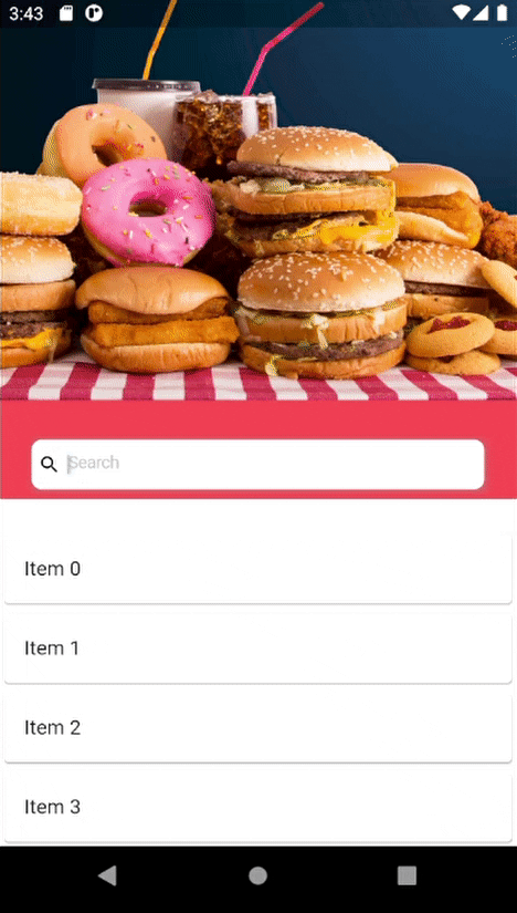
This is a solution to make a layout based on gif image 1:
Using Stack you can make the search bar stack on top of the background. The search bar's offset would be expandedHeight - shrinkOffset - 20 since it should be dependent on how much the app bar is shrinked and the total height of the app bar when its not shrinked. The 20 is half the height of the search bar and its subtracted to make the search bar move up half its height.
@override Widget build(BuildContext context) { return Scaffold( backgroundColor: Colors.white, body: NestedScrollView( headerSliverBuilder: (BuildContext context, bool innerBoxScrolled) { return <Widget>[ SliverPersistentHeader( delegate: MySliverAppBar(expandedHeight: 200, filter: _filter), pinned: true, ), ]; }, body: ListView.builder( itemCount: itemList.length, itemBuilder: (context, index) { return Card( child: ListTile( title: Text(itemList[index]), ), ); })), ); }class MySliverAppBar extends SliverPersistentHeaderDelegate { final double expandedHeight; final TextEditingController filter; MySliverAppBar({@required this.expandedHeight, @required this.filter}); @override Widget build( BuildContext context, double shrinkOffset, bool overlapsContent) { var searchBarOffset = expandedHeight - shrinkOffset - 20; return Stack( fit: StackFit.expand, overflow: Overflow.visible, children: [ Container( child: Image.network( 'assets/mainBackImage.jpg', fit: BoxFit.cover, ), ), (shrinkOffset < expandedHeight - 20) ? Positioned( top: searchBarOffset, left: MediaQuery.of(context).size.width / 4, child: Card( elevation: 10, child: SizedBox( height: 40, width: MediaQuery.of(context).size.width / 2, child: CupertinoTextField( controller: filter, keyboardType: TextInputType.text, placeholder: 'Search', placeholderStyle: TextStyle( color: Color(0xffC4C6CC), fontSize: 14.0, fontFamily: 'Brutal', ), prefix: Padding( padding: const EdgeInsets.fromLTRB(5.0, 5.0, 0.0, 5.0), child: Icon( Icons.search, size: 18, color: Colors.black, ), ), decoration: BoxDecoration( borderRadius: BorderRadius.circular(8.0), color: Colors.white, ), ), ), ), ) : Container( margin: EdgeInsets.symmetric( horizontal: MediaQuery.of(context).size.width / 4, vertical: (kToolbarHeight - 40) / 4 ), child: Card( elevation: 10, child: CupertinoTextField( controller: filter, keyboardType: TextInputType.text, placeholder: 'Search', placeholderStyle: TextStyle( color: Color(0xffC4C6CC), fontSize: 14.0, fontFamily: 'Brutal', ), prefix: Padding( padding: const EdgeInsets.fromLTRB(5.0, 5.0, 0.0, 5.0), child: Icon( Icons.search, size: 18, color: Colors.black, ), ), decoration: BoxDecoration( borderRadius: BorderRadius.circular(8.0), color: Colors.white, ), ), ), ), ], ); } @override double get maxExtent => expandedHeight; @override double get minExtent => kToolbarHeight; @override bool shouldRebuild(SliverPersistentHeaderDelegate oldDelegate) => true;}Result: