Chrome 83: Change colors of new form styling
My preferred solution just uses css. It targets Safari as well as Chrome, but it's already grayscale anyway, so that's OK.
input[type='checkbox']:checked {-webkit-filter: grayscale(100%);}input[type='radio']:checked {-webkit-filter: grayscale(100%);}
This is Chrome 83 upwards specific - other browsers do other things (grayscale mostly).
This construct seems to work for now - just as long as there is a background color set for "body":
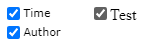
input[type=checkbox] { mix-blend-mode: luminosity;}Examples:
Though I am not sure this will continue to work, it might be good enough as a temporary workaround to alleviate "designer suffering". Disrupted color schemes is a crisis :-).
<!DOCTYPE html><html lang='en'><head> <meta charset='utf-8'> <title>Test</title> <style> body { background-color: white; } input[type=checkbox] { mix-blend-mode: luminosity; } </style></head><body> <label><input type="checkbox" checked>Test</label></body></html>Links:
Pure CSS solution which allows any color while trying to stay close to the new design. Just replace the --primary-color variable. Works in Chromium browsers (Chrome, new Edge) and Firefox.
:root { --primary-color: #f44336;}input[type="checkbox"] { height: 14px; width: 14px; position: relative; -webkit-appearance: none;}input[type="checkbox"]:before { content: ""; display: inline-block; position: absolute; box-sizing: border-box; height: 14px; width: 14px; border-radius: 2px; border: 1px solid #767676; background-color: #fff;}input[type="checkbox"]:hover::before { border: 1px solid #4f4f4f;}input[type="checkbox"]:checked:hover::before { filter: brightness(90%);}input[type="checkbox"]:checked:disabled:hover::before { filter: none;}input[type="checkbox"]:checked:before { content: ""; display: inline-block; position: absolute; box-sizing: border-box; height: 14px; width: 14px; border-radius: 2px; border: 1px solid var(--primary-color); background-color: var(--primary-color);}input[type="checkbox"]:checked:after { content: ""; display: inline-block; position: absolute; top: 5px; left: 2px; box-sizing: border-box; height: 5px; width: 10px; border-left: 2px solid #fff; border-bottom: 2px solid #fff; -webkit-transform: translateY(-1.5px) rotate(-45deg); transform: translateY(-1.5px) rotate(-45deg);}input[type="checkbox"]:disabled::before { border: 1px solid #c9ced1; border-radius: 2px; background-color: #f0f4f8;}input[type="checkbox"]:checked:disabled::before { border: 1px solid #d1d1d1; border-radius: 2px; background-color: #d1d1d1;}<input type="checkbox"></input><input type="checkbox" checked="checked"></input><input type="checkbox" disabled="true"></input><input type="checkbox" disabled="true" checked="checked"></input>