Customise tabs of native base
You can apply, your own style to native base tabs like below.
<Tabs tabBarUnderlineStyle={{borderBottomWidth:2}}> <Tab heading="Popular" tabStyle={{backgroundColor: 'red'}} textStyle={{color: '#fff'}} activeTabStyle={{backgroundColor: 'red'}} activeTextStyle={{color: '#fff', fontWeight: 'normal'}}> // tab content </Tab> <Tab heading="Popular" tabStyle={{backgroundColor: 'red'}} textStyle={{color: '#fff'}} activeTabStyle={{backgroundColor: 'red'}} activeTextStyle={{color: '#fff', fontWeight: 'normal'}}> // tab content </Tab></Tabs>
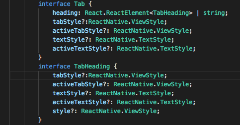
If you're using a component with TabHeading instead of the string heading, using the tabStyle, textStyle props on the Tab or the TabHeading won't work (atleast as of now). You'll have to style your TabHeading, Icon and Text manually.
Here is an example -
This won't work
<Tabs tabBarUnderlineStyle={{borderBottomWidth:2}}> <Tab heading={<TabHeading> <Icon name="icon_name" /> <Text>Popular</Text> </TabHeading>} tabStyle={{backgroundColor: 'red'}} textStyle={{color: '#fff'}} activeTabStyle={{backgroundColor: 'red'}} activeTextStyle={{color: '#fff', fontWeight: 'normal'}}> // tab content </Tab> <Tab heading={<TabHeading> <Icon name="icon_name" /> <Text>Popular</Text> </TabHeading>} tabStyle={{backgroundColor: 'red'}} textStyle={{color: '#fff'}} activeTabStyle={{backgroundColor: 'red'}} activeTextStyle={{color: '#fff', fontWeight: 'normal'}}> // tab content </Tab></Tabs>It won't work even if you move tabStyle and other props to the TabHeading component.
But this will work
<Tabs tabBarUnderlineStyle={{borderBottomWidth:2}}> <Tab heading={<TabHeading style={{backgroundColor: 'red'}}> <Icon name="icon_name" style={{color: '#ffffff'}} /> <Text style={{color: '#ffffff'}}>Popular</Text> </TabHeading>}> // tab content </Tab> <Tab heading={<TabHeading style={{backgroundColor: 'red'}}> <Icon name="icon_name" style={{color: '#ffffff'}} /> <Text style={{color: '#ffffff'}}>Popular</Text> </TabHeading>}> // tab content </Tab></Tabs>If you want active tab style switching
<Tabs tabBarUnderlineStyle={{borderBottomWidth:2}} initialPage={this.state.currentTab} onChangeTab={({ i }) => this.setState({ currentTab: i })}> <Tab heading={<TabHeading style={this.state.currentTab == 0 ? styles.activeTabStyle : styles.inactiveTabStyle}> <Icon name="icon_name" style={this.state.currentTab == 0 ? styles.activeTextStyle : styles.inactiveTextStyle} /> <Text style={this.state.currentTab == 0 ? styles.activeTextStyle : styles.inactiveTextStyle}>Popular</Text> </TabHeading>}> // tab content </Tab> <Tab heading={<TabHeading style={this.state.currentTab == 1 ? styles.activeTabStyle : styles.inactiveTabStyle}> <Icon name="icon_name" style={this.state.currentTab == 1 ? styles.activeTextStyle : styles.inactiveTextStyle} /> <Text style={this.state.currentTab == 1 ? styles.activeTextStyle : styles.inactiveTextStyle}>Popular</Text> </TabHeading>}> // tab content </Tab></Tabs>I tried ☝ solution. It sucks! (in my opinion).
So I went with the original answer and decided not to have an icon in my Tab heading (which was a better price to pay rather than dealing with the state change delay)
I also noticed that they have tabStyle and other props for TabHeading, so maybe they're working on it and this is just a bug at this point of time?
Anyways, I just wanted to point this out.
You can simply achieved by:
<Tabs initialPage={this.state.index} tabBarBackgroundColor='#fff' headerTintColor= '#fff' tabBarUnderlineStyle = {{backgroundColor: navigationColor}} tabBarPosition="top" onChangeTab={({ i }) => this.updateTabIndex(i)} > <Tab heading={ <TabHeading style={{backgroundColor: '#fff'}}> <Image source = {require('../../assets/Images/icon.png')} style = {styles.tabIcon}/> </TabHeading>} > </Tab></Tabs>