How to change selected segment color in SwiftUI Segmented Picker
Native ( but limited )
SwiftUI is not currently supporting native SegmentedPicker styling (see the bottom of the answer for the working workaround). But there is a limited way to apply a color to the segmented picker using .colorMultiply() modifier:
Full control using UIAppearance
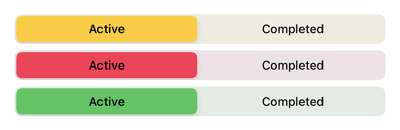
selectedSegmentTintColor is available since beta 3 for changing the color of the selected segment.
For changing the textColor, you should use setTitleTextAttributes for .selected state and .normal state (unselected).
So it will be like:
init() { UISegmentedControl.appearance().selectedSegmentTintColor = .blue UISegmentedControl.appearance().setTitleTextAttributes([.foregroundColor: UIColor.white], for: .selected) UISegmentedControl.appearance().setTitleTextAttributes([.foregroundColor: UIColor.blue], for: .normal)}
Also as mike mentioned, you can set the background color too like:
UISegmentedControl.appearance().backgroundColor = .yellow
Also, don't forget you can set SwiftUI colors too! For example:
UISegmentedControl.appearance().selectedSegmentTintColor = UIColor(Color.accentColor)
This answered helped me, but there is something I would like to add. The color I used was an argument to the view, so placing these methods in an init did not allow me to access the color.
Alternatively, you can use an onAppear method directly on the Segmented Picker, like so.
import SwiftUIstruct PickerView: View { var color: UIColor @State var pickerSelection = 0 var body: some View { Picker(selection: $pickerSelection, label: Text("")) { Text("Active").tag(0).foregroundColor(Color.white) Text("Completed").tag(1) }.pickerStyle(SegmentedPickerStyle()).foregroundColor(Color.orange) .onAppear { UISegmentedControl.appearance().tintColor = color } }}