Xamarin.Forms ListView: Set the highlight color of a tapped item
In Android simply edit your styles.xml file under Resources\values adding this:
<resources> <style name="MyTheme" parent="android:style/Theme.Material.Light.DarkActionBar"> <item name="android:colorPressedHighlight">@color/ListViewSelected</item> <item name="android:colorLongPressedHighlight">@color/ListViewHighlighted</item> <item name="android:colorFocusedHighlight">@color/ListViewSelected</item> <item name="android:colorActivatedHighlight">@color/ListViewSelected</item> <item name="android:activatedBackgroundIndicator">@color/ListViewSelected</item> </style><color name="ListViewSelected">#96BCE3</color><color name="ListViewHighlighted">#E39696</color></resources>
It looks like there is actually a cross-platform way to do this that works on both iOS and Android (not sure about Windows). It uses only binding and does not require custom renderers (which seems rare). This is a mash-up of lots of googling, so thanks to anyone who I may have borrowed from...
I am assuming ViewCells, but this should work for Text or Image cells as well. I am only including the relevant code here beyond the typical text, image, etc.
On your page do something like this:
MyModel model1 = new MyModel();MyModel model2 = new MyModel();ListView list = new ListView{ ItemsSource = new List<MyModel> { model1, model2 }; ItemTemplate = new DataTemplate( typeof(MyCell) )};Your custom Model might look something like this:
public class MyModel : INotifyPropertyChanged{ public event PropertyChangedEventHandler PropertyChanged; private Color _backgroundColor; public Color BackgroundColor { get { return _backgroundColor; } set { _backgroundColor = value; if ( PropertyChanged != null ) { PropertyChanged( this, new PropertyChangedEventArgs( "BackgroundColor" ) ); } } } public void SetColors( bool isSelected ) { if ( isSelected ) { BackgroundColor = Color.FromRgb( 0.20, 0.20, 1.0 ); } else { BackgroundColor = Color.FromRgb( 0.95, 0.95, 0.95 ); } }}Then for your ItemTemplate you need a custom cell class something like this:
public class MyCell : ViewCell{ public MyCell() : base() { RelativeLayout layout = new RelativeLayout(); layout.SetBinding( Layout.BackgroundColorProperty, new Binding( "BackgroundColor" ) ); View = layout; }}Then in your ItemSelected event handler, do the following. Note that 'selected' is an instance of MyModel used to track the currently selected item. I am only showing background color here, but I also use this technique to reverse highlight the text and detail text colors.
private void ItemSelected( object sender, ItemTappedEventArgs args ){ // Deselect previous if ( selected != null ) { selected.SetColors( false ); } // Select new selected = (list.SelectedItem as MyModel); selected.SetColors( true );}
iOS
Solution:
Within a custom ViewCellRenderer you can set the SelectedBackgroundView. Simply create a new UIView with a background color of your choice and you're set.
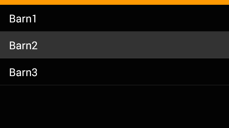
public override UITableViewCell GetCell(Cell item, UITableViewCell reusableCell, UITableView tv){ var cell = base.GetCell(item, reusableCell, tv); cell.SelectedBackgroundView = new UIView { BackgroundColor = UIColor.DarkGray, }; return cell;}Result:
Note:
With Xamarin.Forms it seems to be important to create a new UIView rather than just setting the background color of the current one.
Android
Solution:
The solution I found on Android is a bit more complicated:
Create a new drawable
ViewCellBackground.xmlwithin theResources>drawablefolder:<?xml version="1.0" encoding="UTF-8" ?><selector xmlns:android="http://schemas.android.com/apk/res/android"> <item android:state_pressed="true" > <shape android:shape="rectangle"> <solid android:color="#333333" /> </shape> </item> <item> <shape android:shape="rectangle"> <solid android:color="#000000" /> </shape> </item></selector>It defines solid shapes with different colors for the default state and the "pressed" state of a UI element.
Use a inherited class for the
Viewof yourViewCell, e.g.:public class TouchableStackLayout: StackLayout{}Implement a custom renderer for this class setting the background resource:
public class ElementRenderer: VisualElementRenderer<Xamarin.Forms.View>{ protected override void OnElementChanged(ElementChangedEventArgs<Xamarin.Forms.View> e) { SetBackgroundResource(Resource.Drawable.ViewCellBackground); base.OnElementChanged(e); }}
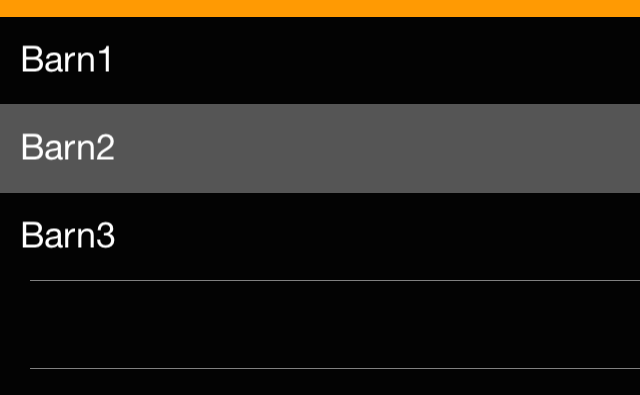
Result: