How can I display a modal dialog in Redux that performs asynchronous actions?
The approach I suggest is a bit verbose but I found it to scale pretty well into complex apps. When you want to show a modal, fire an action describing which modal you'd like to see:
Dispatching an Action to Show the Modal
this.props.dispatch({ type: 'SHOW_MODAL', modalType: 'DELETE_POST', modalProps: { postId: 42 }})(Strings can be constants of course; I’m using inline strings for simplicity.)
Writing a Reducer to Manage Modal State
Then make sure you have a reducer that just accepts these values:
const initialState = { modalType: null, modalProps: {}}function modal(state = initialState, action) { switch (action.type) { case 'SHOW_MODAL': return { modalType: action.modalType, modalProps: action.modalProps } case 'HIDE_MODAL': return initialState default: return state }}/* .... */const rootReducer = combineReducers({ modal, /* other reducers */})Great! Now, when you dispatch an action, state.modal will update to include the information about the currently visible modal window.
Writing the Root Modal Component
At the root of your component hierarchy, add a <ModalRoot> component that is connected to the Redux store. It will listen to state.modal and display an appropriate modal component, forwarding the props from the state.modal.modalProps.
// These are regular React components we will write soonimport DeletePostModal from './DeletePostModal'import ConfirmLogoutModal from './ConfirmLogoutModal'const MODAL_COMPONENTS = { 'DELETE_POST': DeletePostModal, 'CONFIRM_LOGOUT': ConfirmLogoutModal, /* other modals */}const ModalRoot = ({ modalType, modalProps }) => { if (!modalType) { return <span /> // after React v15 you can return null here } const SpecificModal = MODAL_COMPONENTS[modalType] return <SpecificModal {...modalProps} />}export default connect( state => state.modal)(ModalRoot)What have we done here? ModalRoot reads the current modalType and modalProps from state.modal to which it is connected, and renders a corresponding component such as DeletePostModal or ConfirmLogoutModal. Every modal is a component!
Writing Specific Modal Components
There are no general rules here. They are just React components that can dispatch actions, read something from the store state, and just happen to be modals.
For example, DeletePostModal might look like:
import { deletePost, hideModal } from '../actions'const DeletePostModal = ({ post, dispatch }) => ( <div> <p>Delete post {post.name}?</p> <button onClick={() => { dispatch(deletePost(post.id)).then(() => { dispatch(hideModal()) }) }}> Yes </button> <button onClick={() => dispatch(hideModal())}> Nope </button> </div>)export default connect( (state, ownProps) => ({ post: state.postsById[ownProps.postId] }))(DeletePostModal)The DeletePostModal is connected to the store so it can display the post title and works like any connected component: it can dispatch actions, including hideModal when it is necessary to hide itself.
Extracting a Presentational Component
It would be awkward to copy-paste the same layout logic for every “specific” modal. But you have components, right? So you can extract a presentational <Modal> component that doesn’t know what particular modals do, but handles how they look.
Then, specific modals such as DeletePostModal can use it for rendering:
import { deletePost, hideModal } from '../actions'import Modal from './Modal'const DeletePostModal = ({ post, dispatch }) => ( <Modal dangerText={`Delete post ${post.name}?`} onDangerClick={() => dispatch(deletePost(post.id)).then(() => { dispatch(hideModal()) }) }) />)export default connect( (state, ownProps) => ({ post: state.postsById[ownProps.postId] }))(DeletePostModal)It is up to you to come up with a set of props that <Modal> can accept in your application but I would imagine that you might have several kinds of modals (e.g. info modal, confirmation modal, etc), and several styles for them.
Accessibility and Hiding on Click Outside or Escape Key
The last important part about modals is that generally we want to hide them when the user clicks outside or presses Escape.
Instead of giving you advice on implementing this, I suggest that you just don’t implement it yourself. It is hard to get right considering accessibility.
Instead, I would suggest you to use an accessible off-the-shelf modal component such as react-modal. It is completely customizable, you can put anything you want inside of it, but it handles accessibility correctly so that blind people can still use your modal.
You can even wrap react-modal in your own <Modal> that accepts props specific to your applications and generates child buttons or other content. It’s all just components!
Other Approaches
There is more than one way to do it.
Some people don’t like the verbosity of this approach and prefer to have a <Modal> component that they can render right inside their components with a technique called “portals”. Portals let you render a component inside yours while actually it will render at a predetermined place in the DOM, which is very convenient for modals.
In fact react-modal I linked to earlier already does that internally so technically you don’t even need to render it from the top. I still find it nice to decouple the modal I want to show from the component showing it, but you can also use react-modal directly from your components, and skip most of what I wrote above.
I encourage you to consider both approaches, experiment with them, and pick what you find works best for your app and for your team.
Update: React 16.0 introduced portals through ReactDOM.createPortal link
Update: next versions of React (Fiber: probably 16 or 17) will include a method to create portals: ReactDOM.unstable_createPortal() link
Use portals
Dan Abramov answer first part is fine, but involves a lot of boilerplate. As he said, you can also use portals. I'll expand a bit on that idea.
The advantage of a portal is that the popup and the button remain very close into the React tree, with very simple parent/child communication using props: you can easily handle async actions with portals, or let the parent customize the portal.
What is a portal?
A portal permits you to render directly inside document.body an element that is deeply nested in your React tree.
The idea is that for example you render into body the following React tree:
<div className="layout"> <div className="outside-portal"> <Portal> <div className="inside-portal"> PortalContent </div> </Portal> </div></div>And you get as output:
<body> <div class="layout"> <div class="outside-portal"> </div> </div> <div class="inside-portal"> PortalContent </div></body>The inside-portal node has been translated inside <body>, instead of its normal, deeply-nested place.
When to use a portal
A portal is particularly helpful for displaying elements that should go on top of your existing React components: popups, dropdowns, suggestions, hotspots
Why use a portal
No z-index problems anymore: a portal permits you to render to <body>. If you want to display a popup or dropdown, this is a really nice idea if you don't want to have to fight against z-index problems. The portal elements get added do document.body in mount order, which means that unless you play with z-index, the default behavior will be to stack portals on top of each others, in mounting order. In practice, it means that you can safely open a popup from inside another popup, and be sure that the 2nd popup will be displayed on top of the first, without having to even think about z-index.
In practice
Most simple: use local React state: if you think, for a simple delete confirmation popup, it's not worth to have the Redux boilerplate, then you can use a portal and it greatly simplifies your code. For such a use case, where the interaction is very local and is actually quite an implementation detail, do you really care about hot-reloading, time-traveling, action logging and all the benefits Redux brings you? Personally, I don't and use local state in this case. The code becomes as simple as:
class DeleteButton extends React.Component { static propTypes = { onDelete: PropTypes.func.isRequired, }; state = { confirmationPopup: false }; open = () => { this.setState({ confirmationPopup: true }); }; close = () => { this.setState({ confirmationPopup: false }); }; render() { return ( <div className="delete-button"> <div onClick={() => this.open()}>Delete</div> {this.state.confirmationPopup && ( <Portal> <DeleteConfirmationPopup onCancel={() => this.close()} onConfirm={() => { this.close(); this.props.onDelete(); }} /> </Portal> )} </div> ); }}Simple: you can still use Redux state: if you really want to, you can still use connect to choose whether or not the DeleteConfirmationPopup is shown or not. As the portal remains deeply nested in your React tree, it is very simple to customize the behavior of this portal because your parent can pass props to the portal. If you don't use portals, you usually have to render your popups at the top of your React tree for z-index reasons, and usually have to think about things like "how do I customize the generic DeleteConfirmationPopup I built according to the use case". And usually you'll find quite hacky solutions to this problem, like dispatching an action that contains nested confirm/cancel actions, a translation bundle key, or even worse, a render function (or something else unserializable). You don't have to do that with portals, and can just pass regular props, since DeleteConfirmationPopup is just a child of the DeleteButton
Conclusion
Portals are very useful to simplify your code. I couldn't do without them anymore.
Note that portal implementations can also help you with other useful features like:
- Accessibility
- Espace shortcuts to close the portal
- Handle outside click (close portal or not)
- Handle link click (close portal or not)
- React Context made available in portal tree
react-portal or react-modal are nice for popups, modals, and overlays that should be full-screen, generally centered in the middle of the screen.
react-tether is unknown to most React developers, yet it's one of the most useful tools you can find out there. Tether permits you to create portals, but will position automatically the portal, relative to a given target. This is perfect for tooltips, dropdowns, hotspots, helpboxes... If you have ever had any problem with position absolute/relative and z-index, or your dropdown going outside of your viewport, Tether will solve all that for you.
You can, for example, easily implement onboarding hotspots, that expands to a tooltip once clicked:
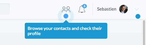
Real production code here. Can't be any simpler :)
<MenuHotspots.contacts> <ContactButton/></MenuHotspots.contacts>Edit: just discovered react-gateway which permits to render portals into the node of your choice (not necessarily body)
Edit: it seems react-popper can be a decent alternative to react-tether. PopperJS is a library that only computes an appropriate position for an element, without touching the DOM directly, letting the user choose where and when he wants to put the DOM node, while Tether appends directly to the body.
Edit: there's also react-slot-fill which is interesting and can help solve similar problems by allowing to render an element to a reserved element slot that you put anywhere you want in your tree
A lot of good solutions and valuable commentaries by known experts from JS community on the topic could be found here. It could be an indicator that it's not that trivial problem as it may seem. I think this is why it could be the source of doubts and uncertainty on the issue.
Fundamental problem here is that in React you're only allowed to mount component to its parent, which is not always the desired behavior. But how to address this issue?
I propose the solution, addressed to fix this issue. More detailed problem definition, src and examples can be found here: https://github.com/fckt/react-layer-stack#rationale
Rationale
react/react-domcomes comes with 2 basic assumptions/ideas:
- every UI is hierarchical naturally. This why we have the idea of
componentswhich wrap each otherreact-dommounts (physically) child component to its parent DOM node by defaultThe problem is that sometimes the second property isn't what you want in your case. Sometimes you want to mount your component into different physical DOM node and hold logical connection between parent and child at the same time.
Canonical example is Tooltip-like component: at some point of development process you could find that you need to add some description for your
UI element: it'll render in fixed layer and should know its coordinates (which are thatUI elementcoord or mouse coords) and at the same time it needs information whether it needs to be shown right now or not, its content and some context from parent components. This example shows that sometimes logical hierarchy isn't match with the physical DOM hierarchy.
Take a look at https://github.com/fckt/react-layer-stack/blob/master/README.md#real-world-usage-example to see the concrete example which is answer to your question:
import { Layer, LayerContext } from 'react-layer-stack'// ... for each `object` in array of `objects` const modalId = 'DeleteObjectConfirmation' + objects[rowIndex].id return ( <Cell {...props}> // the layer definition. The content will show up in the LayerStackMountPoint when `show(modalId)` be fired in LayerContext <Layer use={[objects[rowIndex], rowIndex]} id={modalId}> {({ hideMe, // alias for `hide(modalId)` index } // useful to know to set zIndex, for example , e) => // access to the arguments (click event data in this example) <Modal onClick={ hideMe } zIndex={(index + 1) * 1000}> <ConfirmationDialog title={ 'Delete' } message={ "You're about to delete to " + '"' + objects[rowIndex].name + '"' } confirmButton={ <Button type="primary">DELETE</Button> } onConfirm={ this.handleDeleteObject.bind(this, objects[rowIndex].name, hideMe) } // hide after confirmation close={ hideMe } /> </Modal> } </Layer> // this is the toggle for Layer with `id === modalId` can be defined everywhere in the components tree <LayerContext id={ modalId }> {({showMe}) => // showMe is alias for `show(modalId)` <div style={styles.iconOverlay} onClick={ (e) => showMe(e) }> // additional arguments can be passed (like event) <Icon type="trash" /> </div> } </LayerContext> </Cell>)// ...