Text Area in material-ui
To make TextField work like a textarea you can use multiline prop. You can read more about TextFied and its props here.
Example
<TextField placeholder="MultiLine with rows: 2 and rowsMax: 4" multiline rows={2} rowsMax={4}/>You can set rowsMax={Infinity} if you want to scale your multiline input box with your content (regardless of the content length).
We can use outlined multiline <TextField> for text area
and it could be implemented by creating a theme to apply globally anywhere inside <App/>
theme.js
import { createMuiTheme} from '@material-ui/core/styles';const theme = createMuiTheme({ overrides: { MuiOutlinedInput: { multiline: { fontWeight: 'bold', fontSize: '20px', color: 'purple', width: '50vw' } }} });export default theme;app.js
...import { ThemeProvider } from '@material-ui/core/styles';import Theme from './relevant-path-where-the-above-theme.js-file-is-saved/Theme';......render() { return ( <ThemeProvider theme={Theme}> <div className="App"> <Routes/> </div> </ThemeProvider> ); }SomeComponent.js
...<TextField id="outlined-multiline-static" label="Multiline" multiline rows={10} variant="outlined"/>...Now the style for outlined multiline <TextField> will be applied globally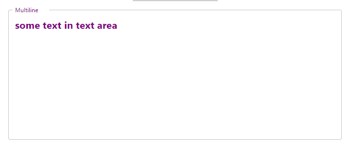
You should use TextareaAutosize API available in material UI.
import TextareaAutosize from '@material-ui/core/TextareaAutosize';or
import { TextareaAutosize } from '@material-ui/core';The following example has all the attributes of TextareaAutosize:https://material-ui.com/components/textarea-autosize/
You can learn more about the difference between the two imports by reading this guide.