Make Bootstrap 3 Tabs Responsive
Slack has a cool way of making tabs small viewport friendly on some of their admin pages. I made something similar using bootstrap. It's kind of a tabs → dropdown.
Demo: http://jsbin.com/nowuyi/1
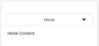
Here's what it looks like on a big viewport:
Here's how it looks collapsed on a small viewport:
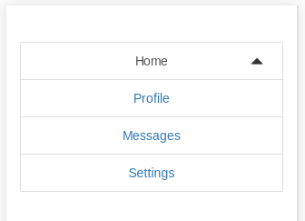
Here's how it looks expanded on a small viewport:
the HTML is exactly the same as default bootstrap tabs.
There is a small JS snippet, which requires jquery (and inserts two span elements into the DOM):
$.fn.responsiveTabs = function() { this.addClass('responsive-tabs'); this.append($('<span class="glyphicon glyphicon-triangle-bottom"></span>')); this.append($('<span class="glyphicon glyphicon-triangle-top"></span>')); this.on('click', 'li.active > a, span.glyphicon', function() { this.toggleClass('open'); }.bind(this)); this.on('click', 'li:not(.active) > a', function() { this.removeClass('open'); }.bind(this));};$('.nav.nav-tabs').responsiveTabs();And then there is a lot of css (less):
@xs: 768px;.responsive-tabs.nav-tabs { position: relative; z-index: 10; height: 42px; overflow: visible; border-bottom: none; @media(min-width: @xs) { border-bottom: 1px solid #ddd; } span.glyphicon { position: absolute; top: 14px; right: 22px; &.glyphicon-triangle-top { display: none; } @media(min-width: @xs) { display: none; } } > li { display: none; float: none; text-align: center; &:last-of-type > a { margin-right: 0; } > a { margin-right: 0; background: #fff; border: 1px solid #DDDDDD; @media(min-width: @xs) { margin-right: 4px; } } &.active { display: block; a { @media(min-width: @xs) { border-bottom-color: transparent; } border: 1px solid #DDDDDD; border-radius: 2px; } } @media(min-width: @xs) { display: block; float: left; } } &.open { span.glyphicon { &.glyphicon-triangle-top { display: block; @media(min-width: @xs) { display: none; } } &.glyphicon-triangle-bottom { display: none; } } > li { display: block; a { border-radius: 0; } &:first-of-type a { border-radius: 2px 2px 0 0; } &:last-of-type a { border-radius: 0 0 2px 2px; } } }}
Bootstrap tabs are not responsive out of the box. Responsive, IMO, is a style change, changing functions is Adaptive. There are a few plugins to turn the Bootstrap 3 tabs into a Collapse component. The best and most updated one is : https://github.com/flatlogic/bootstrap-tabcollapse.
Here's one way of implementing it:
DEMO: http://jsbin.com/zibani/1/
EDIT: http://jsbin.com/zibani/1/edit
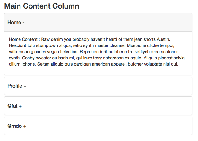
This turns the content into a collapse component:
Dependencies:
- Bootstrap 3.2 css or higher but still in the 3 series
- Bootstrap 3.2 jQuery or higher but still in the 3 series
- Compatible version of bootstrap-tabcollapse.js
HTML -- same as question with class name addition:
<ul class="nav nav-tabs content-tabs" id="maincontent" role="tablist">jQuery:
$(document).ready(function() { // DEPENDENCY: https://github.com/flatlogic/bootstrap-tabcollapse $('.content-tabs').tabCollapse(); // initialize tab function $('.nav-tabs a').click(function(e) { e.preventDefault(); $(this).tab('show'); });});CSS -- optional for fat fingers and active states:
.panel-heading { padding: 0}.panel-heading a { display: block; padding: 20px 10px;}.panel-heading a.collapsed { background: #fff}.panel-heading a { background: #f7f7f7; border-radius: 5px;}.panel-heading a:after { content: '-'}.panel-heading a.collapsed:after { content: '+'}.nav.nav-tabs li a,.nav.nav-tabs li.active > a:hover,.nav.nav-tabs li.active > a:active,.nav.nav-tabs li.active > a:focus { border-bottom-width: 0px; outline: none;}.nav.nav-tabs li a { padding-top: 20px; padding-bottom: 20px;}.tab-pane { background: #fff; padding: 10px; border: 1px solid #ddd; margin-top: -1px;}
There is a new one: http://hayatbiralem.com/blog/2015/05/15/responsive-bootstrap-tabs/
And also Codepen sample available here: http://codepen.io/hayatbiralem/pen/KpzjOL
No needs plugin. It uses just a little css and jquery.
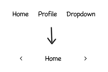
Here's a sample tabs markup:
<ul class="nav nav-tabs nav-tabs-responsive"> <li class="active"> <a href="#tab1" data-toggle="tab"> <span class="text">Tab 1</span> </a> </li> <li class="next"> <a href="#tab2" data-toggle="tab"> <span class="text">Tab 2</span> </a> </li> <li> <a href="#tab3" data-toggle="tab"> <span class="text">Tab 3</span> </a> </li> ...</ul>.. and jQuery codes are also here:
(function($) { 'use strict'; $(document).on('show.bs.tab', '.nav-tabs-responsive [data-toggle="tab"]', function(e) { var $target = $(e.target); var $tabs = $target.closest('.nav-tabs-responsive'); var $current = $target.closest('li'); var $parent = $current.closest('li.dropdown'); $current = $parent.length > 0 ? $parent : $current; var $next = $current.next(); var $prev = $current.prev(); var updateDropdownMenu = function($el, position){ $el .find('.dropdown-menu') .removeClass('pull-xs-left pull-xs-center pull-xs-right') .addClass( 'pull-xs-' + position ); }; $tabs.find('>li').removeClass('next prev'); $prev.addClass('prev'); $next.addClass('next'); updateDropdownMenu( $prev, 'left' ); updateDropdownMenu( $current, 'center' ); updateDropdownMenu( $next, 'right' ); });})(jQuery);