Rendering a React component inside a Bootstrap popover
Bootstrap doesn't make it easy to render a dynamic component within a popover. If the popover you want to present is static, you can simply use React's renderComponentToString which takes a component and returns a string of HTML through a callback:
var html = React.renderComponentToString(<MusicList />);$(this.getDOMNode()).popover({ html: true, content: html});However, if your component has any interactivity, that strategy won't work because React never has a chance to attach event handlers (or run any of your custom lifecycle methods). Indeed, Bootstrap doesn't provide the proper hooks to make your popover content dynamic.
That said, it's possible to make this work by patching Bootstrap. I've created a live demo that has dynamic popover content:
http://jsfiddle.net/spicyj/q6hj7/
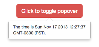
Note that the current time is rendered within the popover by a React component that updates every second.
How was this popover created?
I patched Bootstrap popover's setContent method to take a React component in addition to an HTML or text string. Instead of using jQuery's html or text methods, I use React.renderComponent:
// Patch Bootstrap popover to take a React component instead of a// plain HTML string$.extend($.fn.popover.Constructor.DEFAULTS, {react: false});var oldSetContent = $.fn.popover.Constructor.prototype.setContent;$.fn.popover.Constructor.prototype.setContent = function() { if (!this.options.react) { return oldSetContent.call(this); } var $tip = this.tip(); var title = this.getTitle(); var content = this.getContent(); $tip.removeClass('fade top bottom left right in'); // If we've already rendered, there's no need to render again if (!$tip.find('.popover-content').html()) { // Render title, if any var $title = $tip.find('.popover-title'); if (title) { React.renderComponent(title, $title[0]); } else { $title.hide(); } React.renderComponent(content, $tip.find('.popover-content')[0]); }};Now it's possible for you to write
$(this.getDOMNode()).popover({ react: true, content: <MusicList />});in your componentDidMount method and have it render properly. If you look in the linked JSFiddle, you'll see a general-purpose <BsPopover /> wrapper I made that takes care of all the Bootstrap calls for you, including properly cleaning up the popover components once the wrapper component is removed from the DOM.
There is a new library called React-Bootstrap that is undergoing rapid development.
https://react-bootstrap.github.io/components.html#popovers
If you include this module you have the ability to make the popover its own component that you can save in a variable and then use in your render function.
Their example:
const positionerInstance = ( <ButtonToolbar> <OverlayTrigger trigger="click" placement="bottom" overlay={<Popover title="Popover bottom"><strong>Holy guacamole!</strong> Check this info.</Popover>}> <Button bsStyle="default">Click</Button> </OverlayTrigger> <OverlayTrigger trigger="hover" placement="bottom" overlay={<Popover title="Popover bottom"><strong>Holy guacamole!</strong> Check this info.</Popover>}> <Button bsStyle="default">Hover</Button> </OverlayTrigger> <OverlayTrigger trigger="focus" placement="bottom" overlay={<Popover title="Popover bottom"><strong>Holy guacamole!</strong> Check this info.</Popover>}> <Button bsStyle="default">Focus</Button> </OverlayTrigger> <OverlayTrigger trigger="click" rootClose placement="bottom" overlay={<Popover title="Popover bottom"><strong>Holy guacamole!</strong> Check this info.</Popover>}> <Button bsStyle="default">Click + rootClose</Button> </OverlayTrigger> </ButtonToolbar>);
React.render(positionerInstance, mountNode);
my code:
showMoreDetails: function(obj, columns){
var popOver = ( <Popover> <table> { columns.map(col => <tr> <td style={{textAlign:'right', padding:5}}> {col.label}: </td> <td style={{padding:5}}> {obj[col.key]} </td> </tr> ) } </table> </Popover> ); return( <OverlayTrigger trigger='click' rootClose placement='left' overlay={popOver}> <div className="popover-more">more...</div> </OverlayTrigger> );},
After having posted this reply and having tested and worked a little bit with this work-around, I realize that it is not optimal.
Bootstrap dropdown menus close as soon as the user has interacted with it. This might not be the desired behavior (in my case, I am inserting a datepicker and the user cannot change month without having to reopen the menu to choose new date).
I had the same issue and I came up with an easy and alternative solution.
I did not want to use react-bootstrap (other parts of my app are not reactified and use bootstrap, so I do not want to have two libraries doing the same thing).
The dropdown component provided out of the box by Bootstrap almost provide the same functionalities as the popover, except it is way more flexible.This is the standard Bootstrap dropdown:
<div class="dropdown"> <button id="dLabel" type="button" data-toggle="dropdown" aria-haspopup="true" aria-expanded="false"> Dropdown trigger <span class="caret"></span> </button> <ul class="dropdown-menu" aria-labelledby="dLabel"> ... </ul></div>Here is the minimum you need to make it work without breaking it and you can include whichever React element within it:
<div className="dropdown"> <button data-toggle="dropdown"> Dropdown trigger </button> <div className="dropdown-menu"> <myGreatReactIntervactiveComponent value={this.props.value} onChange={this.handleChange} onClick={this.handleClick} children={this.greatChildrenForMyGreatREactInteractiveComponent} /> </div></div>All you need to keep is (i) the class "dropdown" on the wrapper div, (ii) the data-toggle attribute "dropdown" on the trigger (you can change your trigger to whatever html element you want) and (iii) the class "dropdown-menu" on the dropdown (you can also change it to whatever html element you want and you do not have to stick the "ul" element proposed by Bootstrap).
You loose a few features compared to the popover (you cannot define your own transitions, you cannot have display them on top, left or right, but only below -- it is a dropdown) but you gain total control over the content of your dropdown/popover.