Extend material-ui component in typescript
You can simply use ButtonProps and extend it and add your custom properties along with speading all the rest properties.
The custom Button component
import { Button as MuiButton, ButtonProps, makeStyles} from "@material-ui/core";interface IButtonProps extends ButtonProps { fontSize?: "small" | "medium" | "large";}const useStyles = makeStyles({ small: { fontSize: "0.7em" }, medium: { fontSize: "1.0em" }, large: { fontSize: "1.4em" }});function Button({ fontSize = "medium", children, ...rest }: IButtonProps) { const classes = useStyles(); return ( <MuiButton classes={{ label: classes[fontSize] }} {...rest}> {children} </MuiButton> );}export default Button;You'll have every prop of MUI Button to auto complete along with your custom props like fontSize:
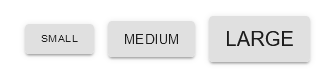
<div className="buttons"> <Button fontSize="small" variant="contained" onClick={() => console.log("small button")} > Small </Button> <Button fontSize="medium" variant="contained" onClick={() => console.log("medium button")} > Medium </Button> <Button fontSize="large" variant="contained" onClick={() => console.log("large button")} > Large </Button></div>Result
You can try the working example with full code completetion at this CodeSandBox React TS Demo App.
PS: If you use ESLint, don't forget to allow JSX Props Spreading by disabling the rule react/jsx-props-no-spreading.
/* eslint-disable react/jsx-props-no-spreading */
With Mui5 use
import React, { useState } from 'react';import { Button as MuiButton, ButtonProps } from '@mui/material';import { styled } from '@mui/material/styles';import { ITheme } from '../../mytheme';export interface IButton extends Omit<ButtonProps, 'size'> { size?: 'small' | 'medium' | 'large' | 'huge'; theme?: ITheme;}const Button: React.FC<IButton> = styled(MuiButton, { skipSx: true, skipVariantsResolver: true,})<IButton>(({ theme }) => { return {//..add your styleoverrides here! or use a theming only approach};});Theming only without nesting MuiComponents follow https://mui.com/customization/theme-components/#adding-new-component-variants
declare module '@mui/material/Button' { interface ButtonPropsVariantOverrides { size: 'large' | 'small' | 'likemoon | 'whatsoever'; }} cheers