Button border with corner radius in Swift UI
Try it like this: Instead of setting the cornerRadius to the Button use an overlay for the inside View:
Button(action: { print("sign up bin tapped") }) { Text("SIGN UP") .frame(minWidth: 0, maxWidth: .infinity) .font(.system(size: 18)) .padding() .foregroundColor(.white) .overlay( RoundedRectangle(cornerRadius: 25) .stroke(Color.white, lineWidth: 2) ) }Works for me. Let me know if it helps!
Updated for Swift 5 & iOS 13.4+ with Press States!
None of the examples worked for buttons with both dark and white background colors as well as none of them had press state updates, so I built this LargeButton view that you can see below. Hope this helps, should be pretty simple to use!
Example Photos
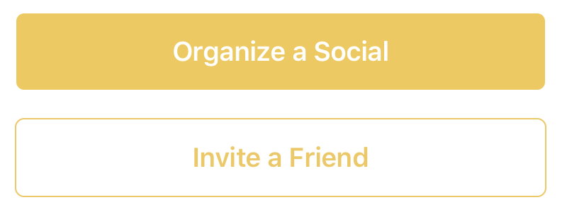
Example Use
// White button with green border.LargeButton(title: "Invite a Friend", backgroundColor: Color.white, foregroundColor: Color.green) { print("Hello World") }// Yellow button without a borderLargeButton(title: "Invite a Friend", backgroundColor: Color.yellow) { print("Hello World") }Code
struct LargeButtonStyle: ButtonStyle { let backgroundColor: Color let foregroundColor: Color let isDisabled: Bool func makeBody(configuration: Self.Configuration) -> some View { let currentForegroundColor = isDisabled || configuration.isPressed ? foregroundColor.opacity(0.3) : foregroundColor return configuration.label .padding() .foregroundColor(currentForegroundColor) .background(isDisabled || configuration.isPressed ? backgroundColor.opacity(0.3) : backgroundColor) // This is the key part, we are using both an overlay as well as cornerRadius .cornerRadius(6) .overlay( RoundedRectangle(cornerRadius: 6) .stroke(currentForegroundColor, lineWidth: 1) ) .padding([.top, .bottom], 10) .font(Font.system(size: 19, weight: .semibold)) }}struct LargeButton: View { private static let buttonHorizontalMargins: CGFloat = 20 var backgroundColor: Color var foregroundColor: Color private let title: String private let action: () -> Void // It would be nice to make this into a binding. private let disabled: Bool init(title: String, disabled: Bool = false, backgroundColor: Color = Color.green, foregroundColor: Color = Color.white, action: @escaping () -> Void) { self.backgroundColor = backgroundColor self.foregroundColor = foregroundColor self.title = title self.action = action self.disabled = disabled } var body: some View { HStack { Spacer(minLength: LargeButton.buttonHorizontalMargins) Button(action:self.action) { Text(self.title) .frame(maxWidth:.infinity) } .buttonStyle(LargeButtonStyle(backgroundColor: backgroundColor, foregroundColor: foregroundColor, isDisabled: disabled)) .disabled(self.disabled) Spacer(minLength: LargeButton.buttonHorizontalMargins) } .frame(maxWidth:.infinity) }}
Swift 5 & iOS 14 – Borders also react when pressed
struct PrimaryButtonStyle: ButtonStyle { func makeBody(configuration: Configuration) -> some View { configuration.label .padding(5) .foregroundColor(configuration.isPressed ? Color.red.opacity(0.5) : .red) .overlay( RoundedRectangle(cornerRadius: 8) .stroke(configuration.isPressed ? Color.red.opacity(0.5) : .red, lineWidth: 1.5) ) }}How to use
Button("Hide") { print("tapped")}.buttonStyle(PrimaryButtonStyle())