Hiding the Arrows for the WPF Expander Control
Unfortunately the ContentPresenter inside the ExpanderTemplate for the header is in the same grid as the arrow, so just setting the HeaderTemplate won't help us.
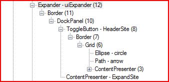
Using Mole we can see that the ToggleButton has an Ellipse - representing the circle, a Path - representing the arrow, and the ContentPresenter which displays what you set for the Header property.
Now that we know the actual layout of the Expander, there's a few ways we could go about modifying it. Creating a brand new ControlTemplate for the Expander, or getting the parts we want to remove and removing/hiding them.
Update: Got a hold of Blend, after generating a Template for the Expander, it pretty much just requires going through and deleting the Ellipse and Path from each ToggleButton style.
<Style x:Key="ExpanderHeaderFocusVisual"> <Setter Property="Control.Template"> <Setter.Value> <ControlTemplate> <Border> <Rectangle SnapsToDevicePixels="true" Margin="0" Stroke="Black" StrokeDashArray="1 2" StrokeThickness="1" /> </Border> </ControlTemplate> </Setter.Value> </Setter></Style><Style x:Key="ExpanderDownHeaderStyle" TargetType="{x:Type ToggleButton}"> <Setter Property="Template"> <Setter.Value> <ControlTemplate TargetType="{x:Type ToggleButton}"> <Border Padding="{TemplateBinding Padding}"> <Grid SnapsToDevicePixels="False" Background="Transparent"> <ContentPresenter SnapsToDevicePixels="True" HorizontalAlignment="Left" VerticalAlignment="Center" RecognizesAccessKey="True" /> </Grid> </Border> </ControlTemplate> </Setter.Value> </Setter></Style><Style x:Key="ExpanderRightHeaderStyle" TargetType="{x:Type ToggleButton}"> <Setter Property="Template"> <Setter.Value> <ControlTemplate TargetType="{x:Type ToggleButton}"> <Border Padding="{TemplateBinding Padding}"> <Grid SnapsToDevicePixels="False" Background="Transparent"> <ContentPresenter SnapsToDevicePixels="True" HorizontalAlignment="Center" VerticalAlignment="Top" RecognizesAccessKey="True" /> </Grid> </Border> </ControlTemplate> </Setter.Value> </Setter></Style><Style x:Key="ExpanderUpHeaderStyle" TargetType="{x:Type ToggleButton}"> <Setter Property="Template"> <Setter.Value> <ControlTemplate TargetType="{x:Type ToggleButton}"> <Border Padding="{TemplateBinding Padding}"> <Grid SnapsToDevicePixels="False" Background="Transparent"> <ContentPresenter SnapsToDevicePixels="True" HorizontalAlignment="Left" VerticalAlignment="Center" RecognizesAccessKey="True" /> </Grid> </Border> </ControlTemplate> </Setter.Value> </Setter></Style><Style x:Key="ExpanderLeftHeaderStyle" TargetType="{x:Type ToggleButton}"> <Setter Property="Template"> <Setter.Value> <ControlTemplate TargetType="{x:Type ToggleButton}"> <Border Padding="{TemplateBinding Padding}"> <Grid SnapsToDevicePixels="False" Background="Transparent"> <ContentPresenter SnapsToDevicePixels="True" HorizontalAlignment="Center" VerticalAlignment="Top" RecognizesAccessKey="True" /> </Grid> </Border> </ControlTemplate> </Setter.Value> </Setter></Style><Style x:Key="ArrowlessExpanderTemplate" TargetType="{x:Type Expander}"> <Setter Property="Foreground" Value="{DynamicResource {x:Static SystemColors.ControlTextBrushKey}}" /> <Setter Property="Background" Value="Transparent" /> <Setter Property="HorizontalContentAlignment" Value="Stretch" /> <Setter Property="VerticalContentAlignment" Value="Stretch" /> <Setter Property="BorderBrush" Value="Transparent" /> <Setter Property="BorderThickness" Value="1" /> <Setter Property="Template"> <Setter.Value> <ControlTemplate TargetType="{x:Type Expander}"> <Border SnapsToDevicePixels="true" Background="{TemplateBinding Background}" BorderBrush="{TemplateBinding BorderBrush}" BorderThickness="{TemplateBinding BorderThickness}" CornerRadius="3"> <DockPanel> <ToggleButton FontFamily="{TemplateBinding FontFamily}" FontSize="{TemplateBinding FontSize}" FontStretch="{TemplateBinding FontStretch}" FontStyle="{TemplateBinding FontStyle}" FontWeight="{TemplateBinding FontWeight}" Foreground="{TemplateBinding Foreground}" HorizontalContentAlignment="{TemplateBinding HorizontalContentAlignment}" Padding="{TemplateBinding Padding}" VerticalContentAlignment="{TemplateBinding VerticalContentAlignment}" FocusVisualStyle="{StaticResource ExpanderHeaderFocusVisual}" Margin="1" MinHeight="0" MinWidth="0" x:Name="HeaderSite" Style="{StaticResource ExpanderDownHeaderStyle}" Content="{TemplateBinding Header}" ContentTemplate="{TemplateBinding HeaderTemplate}" ContentTemplateSelector="{TemplateBinding HeaderTemplateSelector}" DockPanel.Dock="Top" IsChecked="{Binding Path=IsExpanded, Mode=TwoWay, RelativeSource={RelativeSource TemplatedParent}}" /> <ContentPresenter Focusable="false" Visibility="Collapsed" HorizontalAlignment="{TemplateBinding HorizontalContentAlignment}" Margin="{TemplateBinding Padding}" x:Name="ExpandSite" VerticalAlignment="{TemplateBinding VerticalContentAlignment}" DockPanel.Dock="Bottom" /> </DockPanel> </Border> <ControlTemplate.Triggers> <Trigger Property="IsExpanded" Value="true"> <Setter Property="Visibility" TargetName="ExpandSite" Value="Visible" /> </Trigger> <Trigger Property="ExpandDirection" Value="Right"> <Setter Property="DockPanel.Dock" TargetName="ExpandSite" Value="Right" /> <Setter Property="DockPanel.Dock" TargetName="HeaderSite" Value="Left" /> <Setter Property="Style" TargetName="HeaderSite" Value="{StaticResource ExpanderRightHeaderStyle}" /> </Trigger> <Trigger Property="ExpandDirection" Value="Up"> <Setter Property="DockPanel.Dock" TargetName="ExpandSite" Value="Top" /> <Setter Property="DockPanel.Dock" TargetName="HeaderSite" Value="Bottom" /> <Setter Property="Style" TargetName="HeaderSite" Value="{StaticResource ExpanderUpHeaderStyle}" /> </Trigger> <Trigger Property="ExpandDirection" Value="Left"> <Setter Property="DockPanel.Dock" TargetName="ExpandSite" Value="Left" /> <Setter Property="DockPanel.Dock" TargetName="HeaderSite" Value="Right" /> <Setter Property="Style" TargetName="HeaderSite" Value="{StaticResource ExpanderLeftHeaderStyle}" /> </Trigger> <Trigger Property="IsEnabled" Value="false"> <Setter Property="Foreground" Value="{DynamicResource {x:Static SystemColors.GrayTextBrushKey}}" /> </Trigger> </ControlTemplate.Triggers> </ControlTemplate> </Setter.Value> </Setter></Style>Also, we could create an AttachedProperty and set the arrow and circle parts to be collapsed instead.
Here's our AttachedProperty:
public class AttachedProperties{ #region HideExpanderArrow AttachedProperty [AttachedPropertyBrowsableForType(typeof(Expander))] public static bool GetHideExpanderArrow(DependencyObject obj) { return (bool)obj.GetValue(HideExpanderArrowProperty); } [AttachedPropertyBrowsableForType(typeof(Expander))] public static void SetHideExpanderArrow(DependencyObject obj, bool value) { obj.SetValue(HideExpanderArrowProperty, value); } // Using a DependencyProperty as the backing store for HideExpanderArrow. This enables animation, styling, binding, etc... public static readonly DependencyProperty HideExpanderArrowProperty = DependencyProperty.RegisterAttached("HideExpanderArrow", typeof(bool), typeof(AttachedProperties), new UIPropertyMetadata(false, OnHideExpanderArrowChanged)); private static void OnHideExpanderArrowChanged(DependencyObject o, DependencyPropertyChangedEventArgs e) { Expander expander = (Expander)o; if (expander.IsLoaded) { UpdateExpanderArrow(expander, (bool)e.NewValue); } else { expander.Loaded += new RoutedEventHandler((x, y) => UpdateExpanderArrow(expander, (bool)e.NewValue)); } } private static void UpdateExpanderArrow(Expander expander, bool visible) { Grid headerGrid = VisualTreeHelper.GetChild( VisualTreeHelper.GetChild( VisualTreeHelper.GetChild( VisualTreeHelper.GetChild( VisualTreeHelper.GetChild( expander, 0), 0), 0), 0), 0) as Grid; headerGrid.Children[0].Visibility = visible ? Visibility.Collapsed : Visibility.Visible; // Hide or show the Ellipse headerGrid.Children[1].Visibility = visible ? Visibility.Collapsed : Visibility.Visible; // Hide or show the Arrow headerGrid.Children[2].SetValue(Grid.ColumnProperty, visible ? 0 : 1); // If the Arrow is not visible, then shift the Header Content to the first column. headerGrid.Children[2].SetValue(Grid.ColumnSpanProperty, visible ? 2 : 1); // If the Arrow is not visible, then set the Header Content to span both rows. headerGrid.Children[2].SetValue(ContentPresenter.MarginProperty, visible ? new Thickness(0) : new Thickness(4,0,0,0)); // If the Arrow is not visible, then remove the margin from the Content. } #endregion}I'm just traveling directly to the grid that contains the 'arrow' and header content, instead of trying to find the controls by name, so this won't work exactly as is if you are also re-templating the expander into a different structure. Once we've located the containing Grid, we can set the Arrow and Circle to be collapsed, and make sure that the Header Content is moved all the way to the left.
To use the attached property we can just set it on the element in XAML:
<StackPanel> <Expander x:Name="uiExpander" local:AttachedProperties.HideExpanderArrow="True"> <Expander.Header> <Border> <DockPanel Width="Auto"> <TextBlock DockPanel.Dock="Left" FontSize="16" Text="IronRuby in Action!" /> </DockPanel> </Border> </Expander.Header> <Expander.Content> <TextBlock Text="This is the decriprion!" /> </Expander.Content> </Expander> <Button Content="Click to Show/Hide Expander Arrow" Click="Button_Click" /></StackPanel>And in code:
void Button_Click(object sender, RoutedEventArgs e){ uiExpander.SetValue( AttachedProperties.HideExpanderArrowProperty, !(bool)uiExpander.GetValue(AttachedProperties.HideExpanderArrowProperty));}