How suitable Metro style (WinRT) UI is for enterprise apps?
One or two years ago, our team was supported by professional UI designers to redesign a large forms-based application that we are developing (based on WPF). We had the same issues: customers want to display forms with sometimes hundreds of form fields, and ideally they want to see all fields on a single page.
The suggestion by the professionals was: convince your customers that this is a bad idea. Limit the number of fields per screen to maybe a dozen. Only then you will have a user interface that looks good and that is easy to handle.
Therefore, I think it is possible to have an enterprise app with complex forms in Metro, by splitting the complex forms into simpler parts. There are other criteria, however, you need to consider:
How willing are enterprise customers to upgrade to Windows 8? Considering that a large number of enterprise customers still use Windows XP (and sometimes even IE6), I expect them to upgrade only very slowly to Windows 8.
Will enterprise customers prefer Windows Phone 8 over iOS or Android? I am not sure about Android, but my current experience is that decision makers in companies think mainly of iOS when searching for a mobile enterprise application, simply because a lot of them already own iPad/iPhone devices. I think it might take quite some time until Windows Phone 8 comes into their focus.
The big difference between Metro and Classic Windows is that Metro is optimised for touch screen, and consequently the base controls for developing windows 8 are larger and are primarily designed for touch interaction (although they have reasonable mouse support).
Cluttered Forms will be problematic in Windows 8 as the Metro style favours uncluttered user interfaces. This will be especially evident on a tablet where the popup soft keyboard will cover part of the screen, and the window will perform scrolling gymnastics in order to put the currently focussed text box (for example) into view.
All Metro controls could be re-templated to mimic their legacy counterparts (so you could create a Zune-like screen as you describe), but then you would need to ask yourself what would be the benefit of creating the App in Windows 8 if you're not going to utilise the new touch support ?
Howver, there is a big benefit of writing your app in Metro, and that is portability. If you can get the UI design of the App to remain as a Standard Metro app (whilst facilitate your requirements), then your App should run on the Windows Desktop, Windows Tablet, and Windows Phone with minimal extra development effort.
With Windows 8 Mertro you also have the advantage of launching apps through the corporations own pivate 'App Store', but this may also be seen as a hinderance, depending on the security policies of your firm (although Apps can be deployed outisde of tha app store using powershell).
The Metro design philosophy is certainly an interesting one. There's no doubt it can be used to make pretty stunning applications, but it's most certainly not for every application.
Ignoring Windows Store Apps (or whatever Microsoft is calling them this week), the more unique aspects of Metro are:
- Chrome-less
- No gradients
- No rounded corners on borders or containers
- No sub-pixel rendering/anti-aliasing - everything is crisp and sharp
- No shadows, transparency or glass effects *
- Context sensitivity
- Strong use of typography
- Strict usage of colour
* Microsoft actually breaks this one a couple of times - particularly with drop down lists.
A good example of Metro done well in a traditional data-heavy application is Outlook 2013:
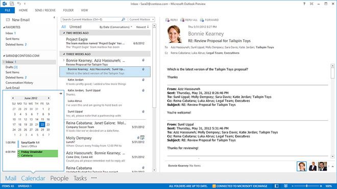
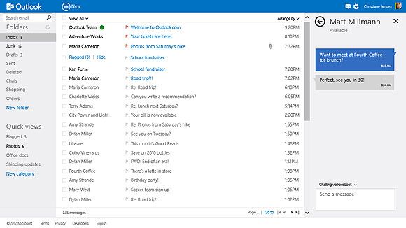
It sticks to the core principles of Metro where data is king and UI distractions should be kept to a minimum. It also lets you see how the same data can be presented via outlook.com:
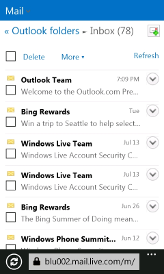
And here's the same site on the mobile site which demonstrates the consistency of the look and feel while making the data manageable for a completely different form factor:
Disclaimer: I personally don't consider touch to be an implicit aspect of Metro design - touch requires additional consideration for things like gesture control, graphical feedback and control spacing. People will no doubt disagree on that one, but then no one ever agrees when it comes to design :)