WPF TreeView: How to style selected items with rounded corners like in Explorer
Adding to @Sheridan's answer
This isn't a 100% accurate but should get you pretty close (it's using the colors from GridView which is pretty close to Windows Explorer)
<TreeView ...> <TreeView.Resources> <LinearGradientBrush x:Key="{x:Static SystemColors.HighlightBrushKey}" EndPoint="0,1" StartPoint="0,0"> <GradientStop Color="#FFD9F4FF" Offset="0"/> <GradientStop Color="#FF9BDDFB" Offset="1"/> </LinearGradientBrush> <LinearGradientBrush x:Key="{x:Static SystemColors.ControlBrushKey}" EndPoint="0,1" StartPoint="0,0"> <GradientStop Color="#FFEEEDED" Offset="0"/> <GradientStop Color="#FFDDDDDD" Offset="1"/> </LinearGradientBrush> <SolidColorBrush x:Key="{x:Static SystemColors.HighlightTextBrushKey}" Color="Black" /> <SolidColorBrush x:Key="{x:Static SystemColors.ControlTextBrushKey}" Color="Black" /> </TreeView.Resources> <TreeView.ItemContainerStyle> <Style TargetType="{x:Type TreeViewItem}"> <Setter Property="BorderThickness" Value="1.5"/> <Style.Triggers> <Trigger Property="IsSelected" Value="True"> <Setter Property="BorderBrush" Value="#adc6e5"/> </Trigger> <MultiTrigger> <MultiTrigger.Conditions> <Condition Property="IsSelected" Value="True"/> <Condition Property="IsSelectionActive" Value="False"/> </MultiTrigger.Conditions> <Setter Property="BorderBrush" Value="LightGray"/> </MultiTrigger> </Style.Triggers> <Style.Resources> <Style TargetType="Border"> <Setter Property="CornerRadius" Value="2"/> </Style> </Style.Resources> </Style> </TreeView.ItemContainerStyle></TreeView>
Add this into your TreeView.ContainerStyle to remove the default blue background.
<Style.Resources> <SolidColorBrush x:Key="{x:Static SystemColors.HighlightBrushKey}" Color="Transparent" /> <SolidColorBrush x:Key="{x:Static SystemColors.ControlBrushKey}" Color="Transparent" /> <SolidColorBrush x:Key="{x:Static SystemColors.HighlightTextBrushKey}" Color="Black" /> <SolidColorBrush x:Key="{x:Static SystemColors.ControlTextBrushKey}" Color="Black" /></Style.Resources>You can replace the Black with whatever colour you want your item text and selected item text to be.
To have a grey background when not focused, you could set up a 'non focused' Style with a grey backgorund and use EventTriggers on the TreeViewItem.GotFocus and LostFocus events to switch between the Styles.
EDIT>>>
If you want to be flash, you can use animations to change between the background colours by adding triggers to your ItemBorder Border directly in your HierarchicalDataTemplate like so:
<Border.Triggers> <EventTrigger RoutedEvent="Border.GotFocus"> <EventTrigger.Actions> <BeginStoryboard> <Storyboard> <ColorAnimation Storyboard.TargetProperty="(Border.Background).(SolidColorBrush.Color)" To="YourColour" Duration="0:0:0.2" /> </Storyboard> </BeginStoryboard> </EventTrigger.Actions> </EventTrigger> <EventTrigger RoutedEvent="Border.LostFocus"> <EventTrigger.Actions> <BeginStoryboard> <Storyboard> <ColorAnimation Storyboard.TargetProperty="(Border.Background).(SolidColorBrush.Color)" To="LightGray" Duration="0:0:0.2" /> </Storyboard> </BeginStoryboard> </EventTrigger.Actions> </EventTrigger></Border.Triggers>Note that this will only work if the ColorAnimation has a From colour. As this code stands, the runtime will look for a SolidColorBrush set on the Border.Background property, so you must set one. You could set the ColorAnimation.From property directly instead.
Windows 10 TreeView (and ListView) Style
I was originally looking for a way to apply the Windows 10 color scheme to a TreeViewItem, including
- IsMouseOver on current item only
- Windows 10 colors which WPF already applies them to ListBox (not Windows Explorer)
If any of you are looking for exactly this, please feel free to take the code below. I used Helge Klein's solution for the IsMouseOver issue and applied the Windows 10 colors to the XAML. Therefore I propose this as an addition to the accepted answer.
Also, see below for a word on ListView and ComboBox as well.
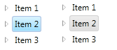
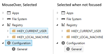
Screenshot
App.xaml
<Style TargetType="{x:Type TreeView}"> <Style.Resources> <SolidColorBrush x:Key="{x:Static SystemColors.HighlightBrushKey}" Color="#CBE8F6" /> <SolidColorBrush x:Key="{x:Static SystemColors.InactiveSelectionHighlightBrushKey}" Color="#F6F6F6" /> <SolidColorBrush x:Key="{x:Static SystemColors.HighlightTextBrushKey}" Color="Black" /> <SolidColorBrush x:Key="{x:Static SystemColors.ControlTextBrushKey}" Color="Black" /> </Style.Resources></Style><Style TargetType="{x:Type TreeViewItem}"> <Setter Property="BorderThickness" Value="1" /> <Style.Triggers> <Trigger Property="IsSelected" Value="True"> <Setter Property="BorderBrush" Value="#26A0DA" /> </Trigger> <MultiTrigger> <MultiTrigger.Conditions> <Condition Property="local:TreeViewItemHelper.IsMouseDirectlyOverItem" Value="True" /> <Condition Property="IsSelected" Value="False" /> </MultiTrigger.Conditions> <Setter Property="Background" Value="#E5F3FB" /> <Setter Property="BorderBrush" Value="#70C0E7" /> </MultiTrigger> <MultiTrigger> <MultiTrigger.Conditions> <Condition Property="IsSelected" Value="True" /> <Condition Property="IsSelectionActive" Value="False" /> </MultiTrigger.Conditions> <Setter Property="BorderBrush" Value="#DADADA" /> </MultiTrigger> </Style.Triggers></Style>TreeViewItemHelper (by Helge Klein, minor changes / simplification)
public static class TreeViewItemHelper{ private static TreeViewItem CurrentItem; private static readonly RoutedEvent UpdateOverItemEvent = EventManager.RegisterRoutedEvent("UpdateOverItem", RoutingStrategy.Bubble, typeof(RoutedEventHandler), typeof(TreeViewItemHelper)); private static readonly DependencyPropertyKey IsMouseDirectlyOverItemKey = DependencyProperty.RegisterAttachedReadOnly("IsMouseDirectlyOverItem", typeof(bool), typeof(TreeViewItemHelper), new FrameworkPropertyMetadata(null, new CoerceValueCallback(CalculateIsMouseDirectlyOverItem))); public static readonly DependencyProperty IsMouseDirectlyOverItemProperty = IsMouseDirectlyOverItemKey.DependencyProperty; static TreeViewItemHelper() { EventManager.RegisterClassHandler(typeof(TreeViewItem), UIElement.MouseEnterEvent, new MouseEventHandler(OnMouseTransition), true); EventManager.RegisterClassHandler(typeof(TreeViewItem), UIElement.MouseLeaveEvent, new MouseEventHandler(OnMouseTransition), true); EventManager.RegisterClassHandler(typeof(TreeViewItem), UpdateOverItemEvent, new RoutedEventHandler(OnUpdateOverItem)); } public static bool GetIsMouseDirectlyOverItem(DependencyObject obj) { return (bool)obj.GetValue(IsMouseDirectlyOverItemProperty); } private static object CalculateIsMouseDirectlyOverItem(DependencyObject item, object value) { return item == CurrentItem; } private static void OnUpdateOverItem(object sender, RoutedEventArgs e) { CurrentItem = sender as TreeViewItem; CurrentItem.InvalidateProperty(IsMouseDirectlyOverItemProperty); e.Handled = true; } private static void OnMouseTransition(object sender, MouseEventArgs e) { lock (IsMouseDirectlyOverItemProperty) { if (CurrentItem != null) { DependencyObject oldItem = CurrentItem; CurrentItem = null; oldItem.InvalidateProperty(IsMouseDirectlyOverItemProperty); } Mouse.DirectlyOver?.RaiseEvent(new RoutedEventArgs(UpdateOverItemEvent)); } }}ListBox/ListView and ComboBox: In Windows 7 (and 8?), this will cause the design from TreeView to ListBox/ListView and ComboBox to differ. Therefore, if you want to apply this color scheme to these control types as well, too, use this:
<Style TargetType="{x:Type ListBoxItem}"> <Setter Property="Template"> <Setter.Value> <ControlTemplate TargetType="{x:Type ListBoxItem}"> <Border Name="Border" BorderThickness="1" Background="Transparent"> <ContentPresenter /> </Border> <ControlTemplate.Triggers> <Trigger Property="IsMouseOver" Value="True"> <Setter TargetName="Border" Property="Background" Value="#E5F3FB" /> <Setter TargetName="Border" Property="BorderBrush" Value="#70C0E7" /> </Trigger> <Trigger Property="IsSelected" Value="True"> <Setter TargetName="Border" Property="Background" Value="#CBE8F6" /> <Setter TargetName="Border" Property="BorderBrush" Value="#26A0DA" /> </Trigger> <MultiTrigger> <MultiTrigger.Conditions> <Condition Property="IsSelected" Value="True" /> <Condition Property="Selector.IsSelectionActive" Value="False" /> </MultiTrigger.Conditions> <Setter TargetName="Border" Property="Background" Value="#F6F6F6" /> <Setter TargetName="Border" Property="BorderBrush" Value="#DADADA" /> </MultiTrigger> </ControlTemplate.Triggers> </ControlTemplate> </Setter.Value> </Setter></Style><Style TargetType="{x:Type ListViewItem}" BasedOn="{StaticResource {x:Type ListBoxItem}}" /><Style TargetType="{x:Type ComboBoxItem}"> <Setter Property="Template"> <Setter.Value> <ControlTemplate TargetType="{x:Type ComboBoxItem}"> <Border Name="Border" BorderThickness="1" Padding="1" Background="Transparent"> <ContentPresenter /> </Border> <ControlTemplate.Triggers> <Trigger Property="IsMouseOver" Value="True"> <Setter TargetName="Border" Property="Background" Value="#E5F3FB" /> <Setter TargetName="Border" Property="BorderBrush" Value="#70C0E7" /> </Trigger> <Trigger Property="IsSelected" Value="True"> <Setter TargetName="Border" Property="Background" Value="#CBE8F6" /> <Setter TargetName="Border" Property="BorderBrush" Value="#26A0DA" /> </Trigger> </ControlTemplate.Triggers> </ControlTemplate> </Setter.Value> </Setter></Style>