iOS different constraints for different devices
Easy way!
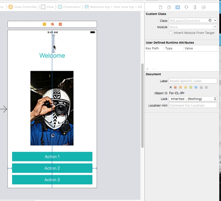
To overcome this issue I created a small library so you don't have to write a single line of code just assign the class (NSLayoutHelper) to your constraint and you'll be able to update your constraint for all the devices differently.
For updating constraints
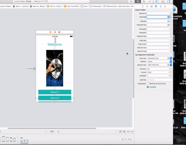
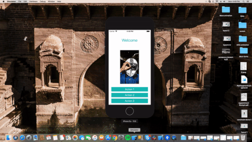
Output
we were facing similar issue. We solved with helper class called scaled. Which basically just multiply size of something, which should appear larger on larger device.
extension CGFloat { public var scaled: CGFloat { switch UIDevice.type.getResolutionGroup()! { case .lr320x568: return self case .lr375x667: return self * 1.1 case .lr414x736: return self * 1.2 case .lr768x1024: return self * 1.3 // For iPads case .lr1024x1366: return self * 1.3 } }}And implementation of resolution group
public func getResolutionGroup() -> ResolutionGroup? { switch self { case .iPhone5, .iPhone5C, .iPhone5S, .iPhoneSE, .iPodTouch5, .iPodTouch6: return .lr320x568 case .iPhone6, .iPhone6S, .iPhone7: return .lr375x667 case .iPhone6Plus, .iPhone6SPlus, .iPhone7Plus: return .lr414x736 case .iPadMini, .iPadMini2, .iPadMini3, .iPadMini4: return .lr768x1024 case .iPad2, .iPad3, .iPad4, .iPadAir, .iPadAir2: return .lr768x1024 case .iPadPro: return .lr1024x1366 case .simulator: return isiPhone() ? .lr320x568 : .lr768x1024 default: return .lr320x568 } }And usage in app
fileprivate let footerHeight = CGFloat(180).scaled
Not using Interface Builder, no. Constraints, can only target Compact, Regular or Any sizes and all iPhone models have Compact width and Regular height when in portrait mode.
If you want that kind of granularity, you have to do it with code instead.