Android: Make a button with triangle shape using xml definitions (drawable)
If someone still has issues with this :
xml:
<item android:top="45dp"> <shape> <size android:height="100dp" android:width="90dp"/> <solid android:color="@android:color/holo_orange_light" /> </shape></item><item android:top="36dp" android:left="11dp"> <rotate android:fromDegrees="45" android:toDegrees="0" android:pivotX="80%" android:pivotY="20%" > <shape> <size android:width="40dp" android:height="30dp"/> <stroke android:color="@android:color/holo_orange_light" android:width="1dp"/> <solid android:color="@android:color/holo_orange_light" /> </shape> </rotate></item></layer-list>override TextView and use it in your layout:
public class CustomTextView extends TextView { private int mWidth; private int mHeight; public CustomTextView(Context context, AttributeSet attrs) { super(context, attrs); } @Override protected void onDraw(Canvas canvas) { super.onDraw(canvas); Paint mPaint = new Paint(); int color = getResources().getColor(R.color.YourColor); mPaint.setColor(color); Path mPath = new Path(); mPath.moveTo(.0f, this.getHeight()); mPath.lineTo(0.8f * this.getWidth(), this.getHeight()); mPath.lineTo(this.getWidth(), 0.5f * this.getHeight()); mPath.lineTo(0.8f * this.getWidth(), .0f); mPath.lineTo(.0f, .0f); mPath.lineTo(.0f, this.getHeight()); canvas.clipPath(mPath); canvas.drawPath(mPath,mPaint); }}
Regarding the xml example: there are two rectangles overlapping.You have to play around with the values a lot and this makes it difficult to use on different views. I think using a custom view is the best solution in this case.
You can achieve it also using a MaterialButton included in the Material Components library.
Add the MaterialButton in your layout then:
- use the
app:iconattribute to add an icon on the left - apply the style
Widget.MaterialComponents.Button.Iconprovided by the library - define a custom shape using the
app:shapeAppearanceOverlayattribute (it requires v.1.1.0)
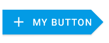
Something like:
<com.google.android.material.button.MaterialButton style="@style/Widget.MaterialComponents.Button.Icon" app:icon="@drawable/ic_add_24px" android:text="..." app:shapeAppearanceOverlay="@style/CustomShapeAppearanceOverlay.Button" .../>where the shapeAppearanceOverlay is defined in your styles.xml:
<style name="CustomShapeAppearanceOverlay.Button" parent=""> <item name="cornerFamily">rounded</item> <item name="cornerSizeTopLeft">0dp</item> <item name="cornerSizeBottomLeft">0dp</item> <item name="cornerFamilyTopRight">cut</item> <item name="cornerFamilyBottomRight">cut</item> <item name="cornerSizeTopRight">18dp</item> <item name="cornerSizeBottomRight">18dp</item> </style>The final result:
<item> <inset android:insetBottom="2dp" > <selector xmlns:android="http://schemas.android.com/apk/res/android" > <item android:state_pressed="true"> <shape android:shape="rectangle" > <corners android:radius="3dip" /> <stroke android:width="1dip" android:color="#5e7974" /> <gradient android:angle="-90" android:centerColor="#ECEFF1" android:endColor="#FFAB00" android:startColor="#FFAB00" /> </shape> </item> <item android:state_focused="true"> <shape android:shape="rectangle" > <corners android:radius="3dip" /> <stroke android:width="1dip" android:color="#5e7974" /> <gradient android:angle="-90" android:centerColor="#ECEFF1" android:endColor="#FFAB00" android:startColor="#FFAB00" /> </shape> </item> <item> <shape android:shape="rectangle" > <corners android:radius="3dip" /> <stroke android:width="1dip" android:color="#5e7974" /> <gradient android:angle="-90" android:centerColor="#ECEFF1" android:endColor="#FFD600" android:startColor="#FFD600" /> </shape> </item> </selector> </inset></item><item android:bottom="65dp" android:right="-129dp" android:top="-40dp"> <rotate android:fromDegrees="50" > <shape android:shape="rectangle" > <solid android:color="@color/background_color_light_yellow" /> </shape> </rotate></item><item android:bottom="-40dp" android:right="-129dp" android:top="65dp"> <rotate android:fromDegrees="-50" > <shape android:shape="rectangle" > <solid android:color="@color/background_color_light_yellow" /> </shape> </rotate></item>