creating a Circular view in android
For the layout of each circle I suggest this answer to question layout with buttons in a circle because it defines your item positions relative to the center of the enclosing RelativeLayout regardless of its size. You can then overlay the two circle layouts thus:
<RelativeLayout ...> <RelativeLayout // outer circle android:layout_alignParentCenter> ... </RelativeLayout> <RelativeLayout // inner circle android:layout_alignParentCenter> ... </RelativeLayout></RelativeLayout>To rotate each of the circles independently, I suggest following this answer to question **Rotate View Hierarchy 90 Degrees".
If you are not looking for an animated circular view, you can use Absolute Layout, and position them in code using an algorithm to check if the various (x, y) positions fall on a circle's circumference.
Assuming you want the circular view centered at (x,y) and radius r to have n items, then the co-ordinates would be:
(x + r, y) // for the first element....(x + (r * (FloatMath.cos((p-1) * 2 * Math.PI / n))), y - (r * (FloatMath.sin((p-1) * 2 * Math.PI / n)))) // for the 'p'th element
I am a bit late to answer this, but for anyone who is still facing this Problem, Please take a look at this Library:
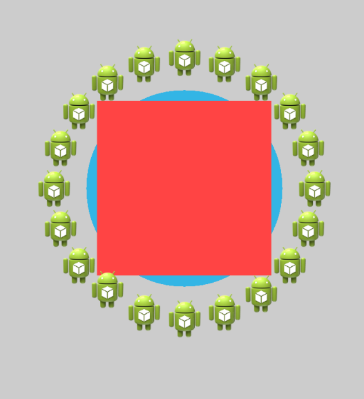
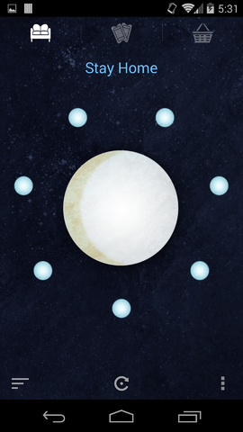
https://github.com/sababado/CircularView
Edit:
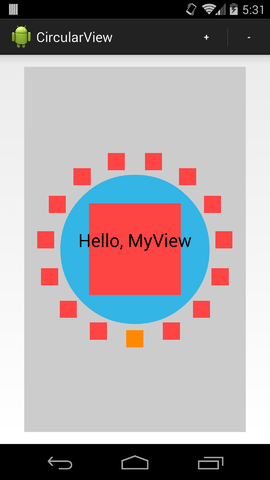
Quick Setup
Adding the view to a layout
<com.sababado.circularview.CircularViewandroid:id="@+id/circular_view"android:layout_width="match_parent"android:layout_height="match_parent"app:centerBackgroundColor="#33b5e5"app:centerDrawable="@drawable/center_bg"/> Using the custom attributes requires the following in the layout file. Examplexmlns:app="http://schemas.android.com/apk/res-auto" Adding Markers
A Marker is an object that visual "floats" around the view. Each marker is can represent data or it can simply be for visual effect. Markers must be customized through a CircularViewAdapter.
public class MySimpleCircularViewAdapter extendsSimpleCircularViewAdapter {@Overridepublic int getCount() { // This count will tell the circular view how many markers to use. return 20;}@Overridepublic void setupMarker(final int position, final Marker marker) { // Setup and customize markers here. This is called every time a marker is to be displayed. // 0 >= position > getCount() // The marker is intended to be reused. It will never be null. marker.setSrc(R.drawable.ic_launcher); marker.setFitToCircle(true); marker.setRadius(10 + 2 * position);} }Once the CircularViewAdapter implementation is ready it can be set on a CircularView object.
mAdapter = new MySimpleCircularViewAdapter(); circularView =(CircularView) findViewById(R.id.circular_view);circularView.setAdapter(mAdapter); Receiving click listenersClick events can be received from the CircularView.
To receive click events set a CircularView.OnClickListener into circularView.setOnCircularViewObjectClickListener(l). For example:
circularView.setOnCircularViewObjectClickListener(newCircularView.OnClickListener() { public void onClick(final CircularView view) { Toast.makeText(MainActivity.this, "Clicked center", Toast.LENGTH_SHORT).show();}public void onMarkerClick(CircularView view, Marker marker, int position) { Toast.makeText(MainActivity.this, "Clicked " + marker.getId(), Toast.LENGTH_SHORT).show();} }); AnimationThere are a few simple animations built into the library at the moment.
Animate Highlighted Degree
The CircularView has animateHighlightedDegree(start, end, duration). The method takes a start and end position in degrees, and a long value for the duration of the animation. The highlighted degree refers to which degree is "highlighted" or "focused". When a degree is focused it can trigger a secondary animation automatically for a Marker.
A listener can be set to receive a callback when this animation ends, and on what object it stopped on.
circularView.setOnHighlightAnimationEndListener(newCircularView.OnHighlightAnimationEndListener() {@Overridepublic void onHighlightAnimationEnd(CircularView view, Marker marker, int position) { Toast.makeText(MainActivity.this, "Spin ends on " + marker.getId(), Toast.LENGTH_SHORT).show();} }); Marker Animation OptionsMarkers have a simple animation associated with them; up and down. It can repeat or it can happen once. The CircularView can trigger the bounce animation when animateHighlightedDegree(start, end, duration) is called. The bounce animation can be turned off by calling the same method with an additional flag. For example:
animateHighlightedDegree(start, end, duration, shouldAnimateMarkers) In addition there is control over if a marker should bounce while it is highlighted and while the highlighted degree value is constant (aka not animating).
// Allow markers to continuously animate on their own when the highlight animation isn't running. circularView.setAnimateMarkerOnStillHighlight(true); // Combine the above line with the following so that the marker at it's position will animate at the start. circularView.setHighlightedDegree(circularView.BOTTOM); The latter line is necessary in case the bounce animation should also run initially. The highlighted degree is set to CircularView.HIGHLIGHT_NONE by default.
Proguard
If using proguard add the following to your proguard script to make sure animations run
# keep setters in Views so that animations can still work.# see http://proguard.sourceforge.net/manual/examples.html#beans-keepclassmembers public class * extends android.view.View { void set*(***); *** get*(); }# keep setters in CircularViewObjects so that animations can still work.-keepclassmembers public class * extends com.sababado.circularview.CircularViewObject { void set*(***); *** get*(); } Developer HintsEvery property that can be customized on a CircularViewObject can also be customized on a Marker object. A Marker object extends from a CircularViewObject. The former is used as a smaller object that floats around the center object. The center object is a CircularViewObject. By default, markers are drawn in the order that they're created; meaning if markers overlap then the first marker will be partially covered by the next marker. An option can be set to draw the highlighted marker on top of the markers next to it with circularView.setDrawHighlightedMarkerOnTop(true);. The flag is false by default. Any CircularViewObject can be hidden and shown independently of other objects using setVisibility(int) In a layout editor use the attribute editMode_markerCount and editMode_markerRadius to see the size and layout of markers. Not supplying a radius will show the default radius. It does exactly what is asked in Question.
I hope this helps.